Logo Mark
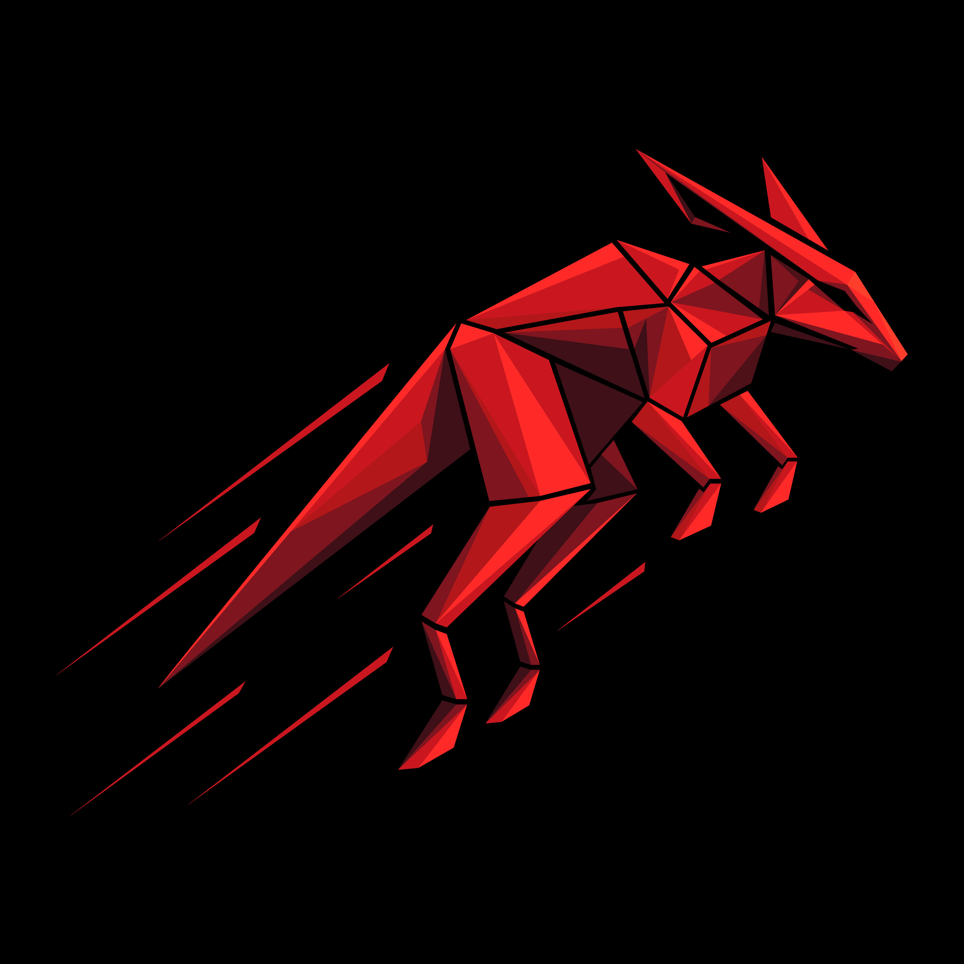
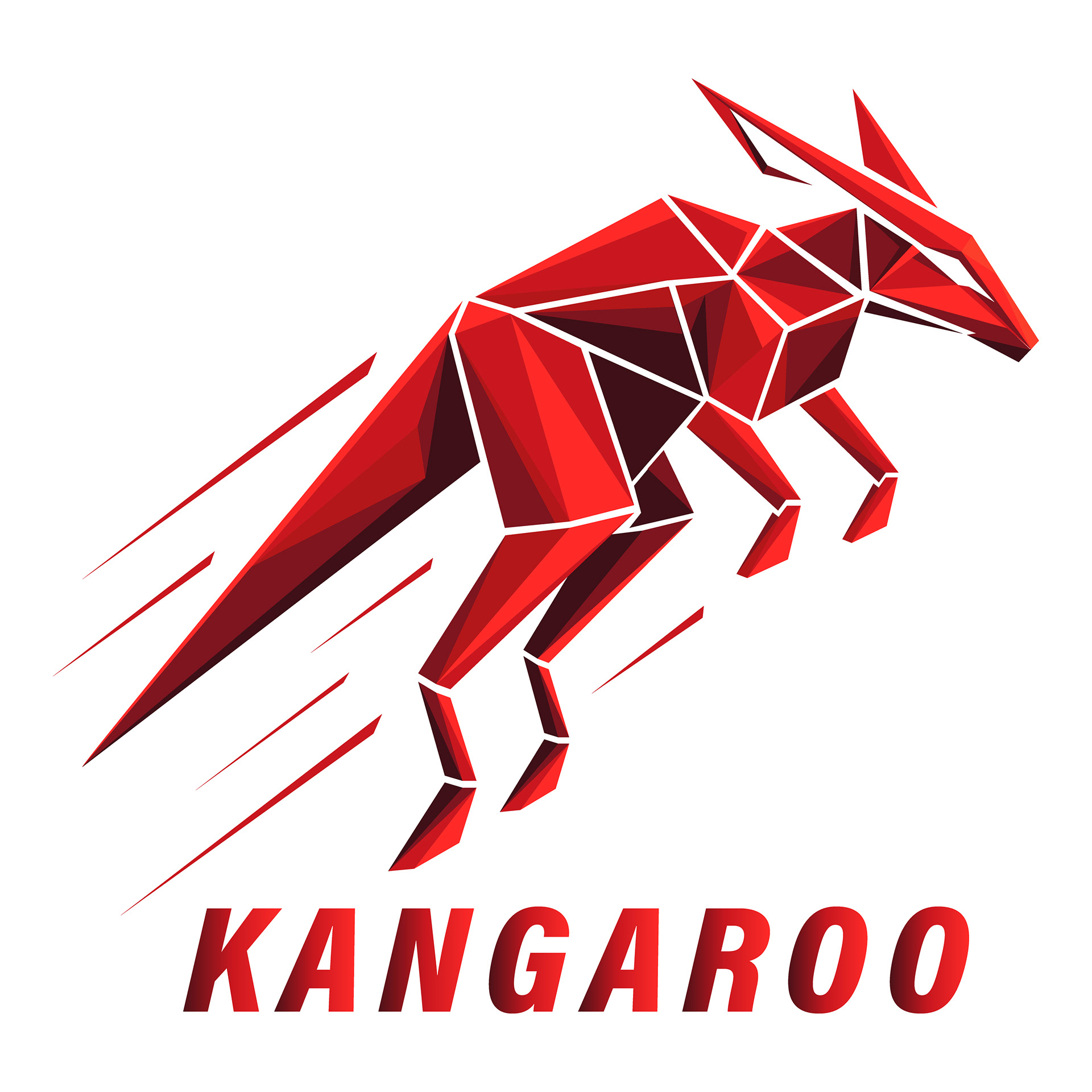
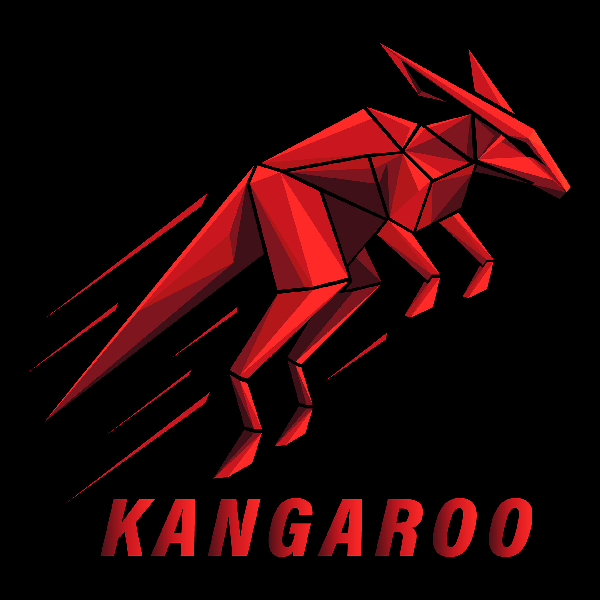
The logo mark represents a dynamic geometric kangaroo designed with sharp polygonal forms.
Its forward-leaning posture and faceted structure express speed, strength, and modern athletic energy, making it suitable for premium menswear and performance-oriented branding.
Its forward-leaning posture and faceted structure express speed, strength, and modern athletic energy, making it suitable for premium menswear and performance-oriented branding.

Color & Contrast
The vibrant red tones provide a powerful focal point, while the dark background enhances depth and clarity.
The mark maintains visual impact across light and dark surfaces.
The mark maintains visual impact across light and dark surfaces.
Design Characteristics
Built entirely from precise vector polygons
strong angular geometry for a bold and modern appearance
high recognizability even at small sizes
works effectively in both color and monochrome versions
captures the brand’s core values: agility, movement, and confidence
Logo Construction Grid
This geometric construction grid defines the proportions, balance, and angular rhythm of the Kangaroo logomark.
The circle system highlights how each shape connects harmoniously, ensuring precision, consistency, and dynamic movement throughout the design.
The circle system highlights how each shape connects harmoniously, ensuring precision, consistency, and dynamic movement throughout the design.
Wordmark
The wordmark presents the brand name KANGAROO in a bold, modern typeface that reflects confidence, strength, and clean visual structure.
Its simplicity and strong presence make it an essential component of the identity, perfectly complementing the sharp geometric style of the logo mark.
Its simplicity and strong presence make it an essential component of the identity, perfectly complementing the sharp geometric style of the logo mark.

Design Characteristics
- bold and masculine typography
- refined kerning and tracking for optimal visual balance
- minimalistic and versatile structure
- designed to pair seamlessly with the polygonal kangaroo symbol
- highly legible in both large titles and small-scale applications
Function & Usage
The wordmark is intended for use in situations where the brand name must stand alone — such as website headers, apparel tags, packaging, or simplified branding layouts.
Its strong visual weight ensures consistent recognition even without the accompanying icon.
Its strong visual weight ensures consistent recognition even without the accompanying icon.
Color Variants
The wordmark is available in:
- solid black (for light backgrounds)
- solid white (for dark backgrounds)
- optional accent red version for high-impact compositions


Combined Logos
The combined logo brings together the geometric kangaroo symbol and the bold KANGAROO wordmark, creating a unified and powerful brand signature.
This configuration delivers the full visual identity in a single mark — dynamic, modern, and instantly recognizable.
This configuration delivers the full visual identity in a single mark — dynamic, modern, and instantly recognizable.
Horizontal Logo
The horizontal configuration aligns the geometric kangaroo symbol with the KANGAROO wordmark in a clean, linear layout.
This format is ideal for:
- website headers
- apparel labels
- packaging fronts
- wide-format prints
- brand signatures requiring strong left-to-right readability
The horizontal lockup emphasizes speed, direction, and movement — reinforcing the dynamic personality of the brand.


Vertical Logo
The vertical configuration stacks the logo mark above the wordmark, creating a compact and visually centered layout.
This version is optimal for:
-square or compact spaces
-social media profiles and app icons
-hangtags, patches, and woven labels
-product packaging details
-print materials requiring a balanced, centered composition
The vertical lockup provides maximum versatility and works particularly well in premium apparel applications.
Monochrome Logo
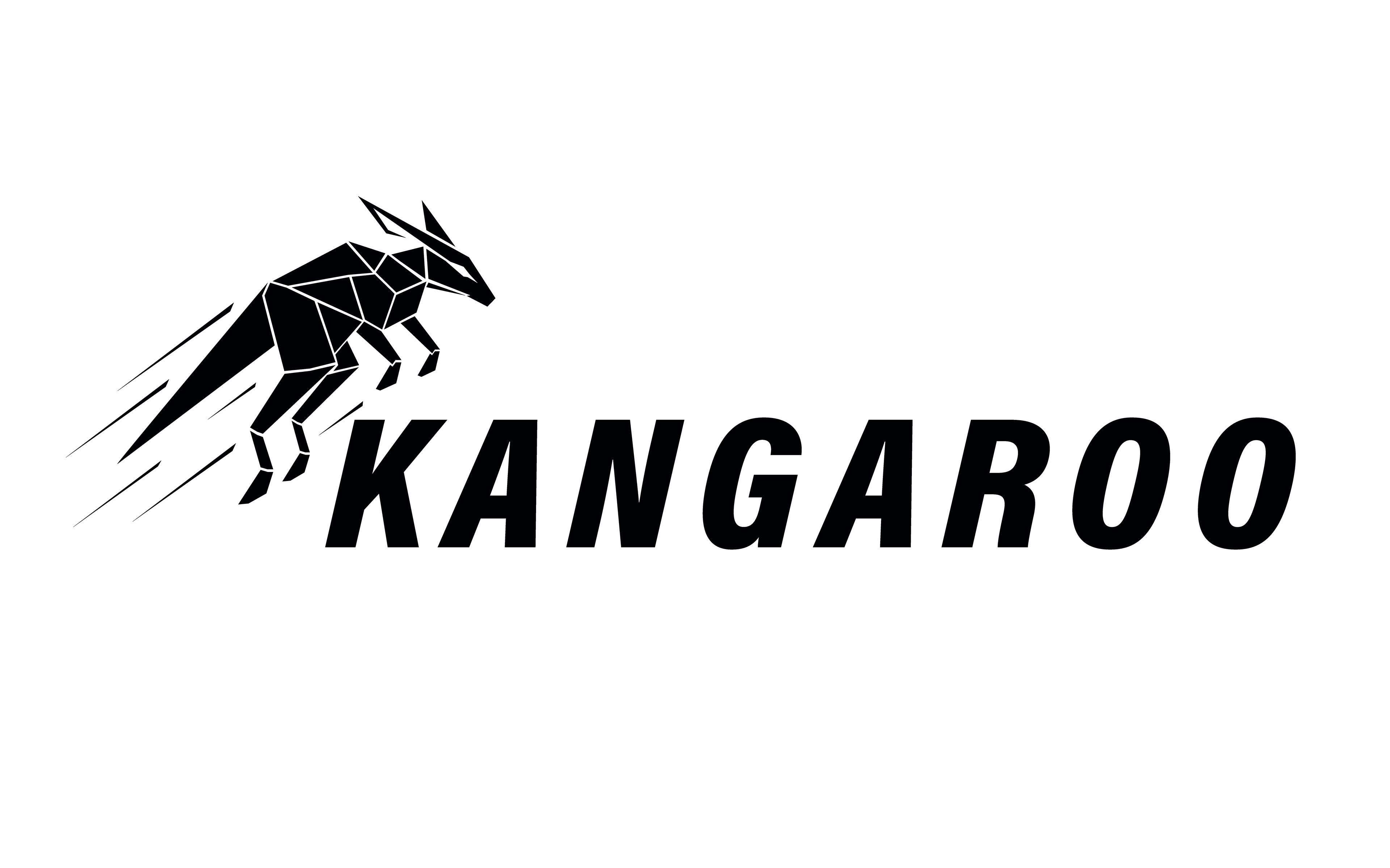
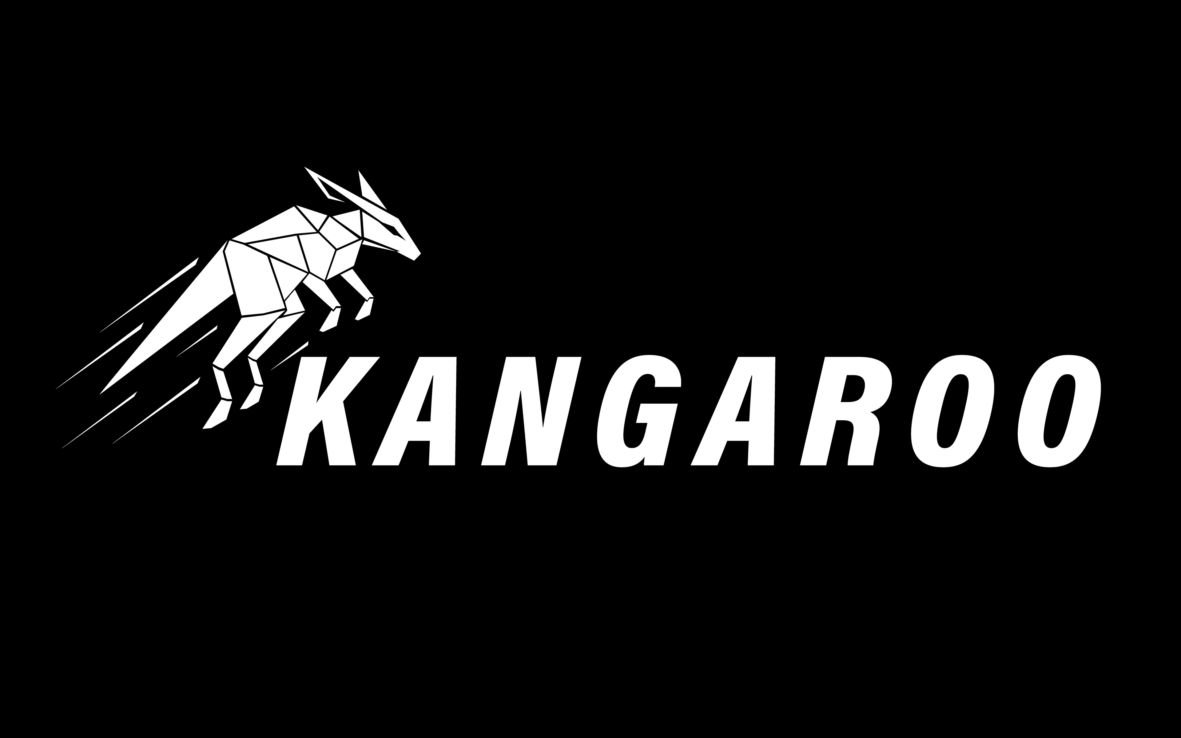
The monochrome versions ensure that the Kangaroo identity remains strong, recognizable, and functional in situations where color cannot be used.
Both the symbol and the wordmark maintain their visual integrity, allowing the brand to adapt seamlessly to a wide range of materials and printing methods.
Both the symbol and the wordmark maintain their visual integrity, allowing the brand to adapt seamlessly to a wide range of materials and printing methods.
Design Characteristics
- simplified single-color versions for maximum clarity
- perfect readability in small sizes and low-contrast environments
- ideal for embroidery, engraving, stamping, laser cuts, and minimal print
- maintains the sharp geometric character of the primary logo
- optimized negative space for clean reproduction on all surfaces
Light & Dark Backgrounds
To guarantee consistent performance, the monochrome logo is provided in:
- solid black (for light backgrounds)
- solid white (for dark backgrounds)
Both variations preserve the brand’s bold, energetic expression even without color.
Usage Examples
- apparel labels and woven tags
- embossed or debossed leather patches
- print materials with limited color printing
- engraving, metal finishes, or textile applications
- icons, stamps, or simplified digital assets

Color Palette
The Kangaroo Menswear identity relies on a bold, high-contrast color system designed to express speed, strength, and modern precision.
The palette is built around three dynamic reds, supported by carbon-black tones inspired by performance materials.
The palette is built around three dynamic reds, supported by carbon-black tones inspired by performance materials.
Primary Red
Used for the main kangaroo shapes and brand-defining elements.
Highlight Red
Applied to edges, reflections, and speed accents to enhance motion.
Shadow Red
Deep tint used in geometric shadows to create depth and dimension.
Carbon Black
Primary background tone providing a premium, technical feel.
Gunmetal Grey
Secondary neutral supporting typography and minimal details.
Typography
Primary Typeface – Wordmark
The primary typeface of the Kangaroo Menswear identity is Acumin Variable Concept in its Condensed Black Italic variant.
This style was chosen for its:
This style was chosen for its:
- Strong, athletic presence
- High legibility at all sizes
- Dynamic forward-leaning posture, reinforcing speed and motion
- Modern, clean geometry that aligns with the angular logo mark
This typeface forms the foundation of the main KANGAROO wordmark.
Secondary Typeface – Menswear Label
The supporting typeface, used for the “Menswear” descriptor, is Cormorant Garamond Semibold.
It adds:
- Elegance and sophistication, balancing the aggressive geometric logo
- Subtle luxury cues, suitable for premium apparel
- A refined serif contrast that elevates the overall brand identity
This typeface is primarily used for sub-labels, descriptors, and premium product lines.
Brand Apparel Applications
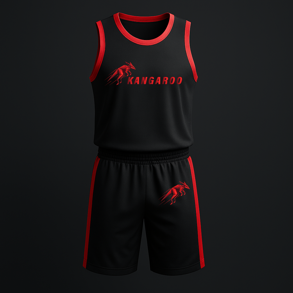
A series of premium clothing mockups showcasing how the Kangaroo brand identity translates on real products.
Clean shapes, bold colors and a dynamic logo create a modern, high-performance visual style across jackets and athletic wear.”
Clean shapes, bold colors and a dynamic logo create a modern, high-performance visual style across jackets and athletic wear.”

Web Interface Concepts
A set of sleek, premium UI mockups designed to extend the Kangaroo identity into digital experiences.
Clean layouts, bold accents, and sharp typography reflect the brand’s dynamic and performance-focused character.
Clean layouts, bold accents, and sharp typography reflect the brand’s dynamic and performance-focused character.
Product Page UI
A clean e-commerce product page concept showcasing the Kangaroo jacket.
Bold contrast, clear visual hierarchy, and strong brand-aligned accents.
Bold contrast, clear visual hierarchy, and strong brand-aligned accents.
Landing Page Concept
A dark, stylish homepage layout designed to reflect the premium, performance-driven character of the Kangaroo brand
A clean and consistent icon set designed to support the brand’s sporty and technical identity.
Each icon is built with the same stroke weight, rounded geometry and the signature Kangaroo red, ensuring visual harmony across all applications.
Included Icons
- Durability – Shield symbol
- Water Resistance – Droplet symbol
- Precision – Chronograph watch symbol
Thank you for watching !

