

Brand Story
Retro Vision is an online platform that digitizes old movies and cartoons from VHS tapes and DVDs, making them available again in a modern streaming format.
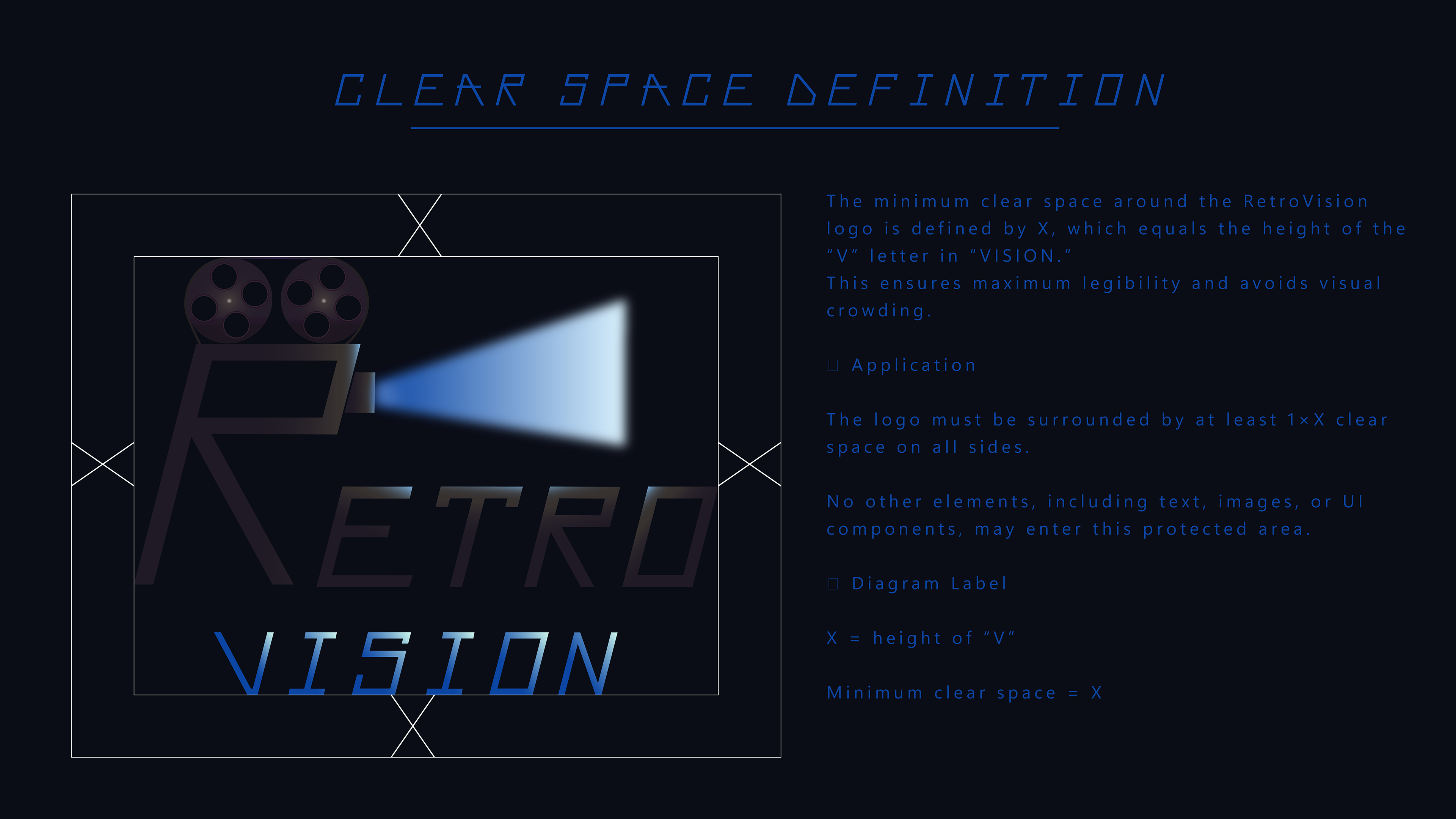
Retro Vision – Official Color Palette
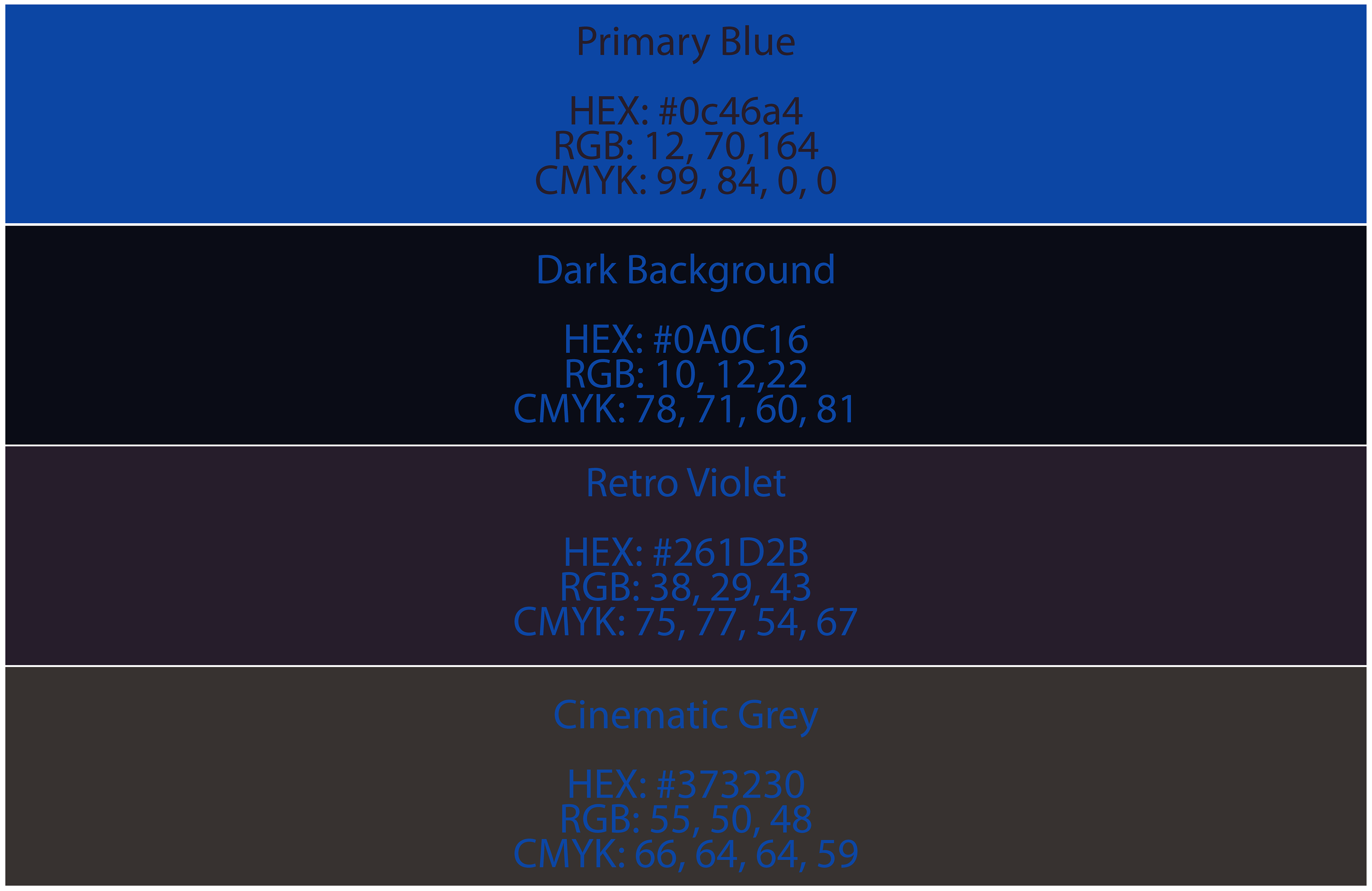
Primary Blue – #0C46A4
Used in the light beam and the “VISION” typography. This is the main accent color that brings a modern cinematic feel to the identity.
Dark Background – #0A0C16
The core background tone, inspired by dark cinema rooms and vintage film projection environments. Perfect for high-contrast logo presentations.
Retro Violet – #261D2B
A muted violet shade used in the “RETRO” lettering and projector body elements. Adds a subtle nostalgic character to the brand.
Cinematic Grey – #373230
A soft grey tone found in the projector and film reels. Works as a neutral supporting color to balance the dark and vibrant elements.
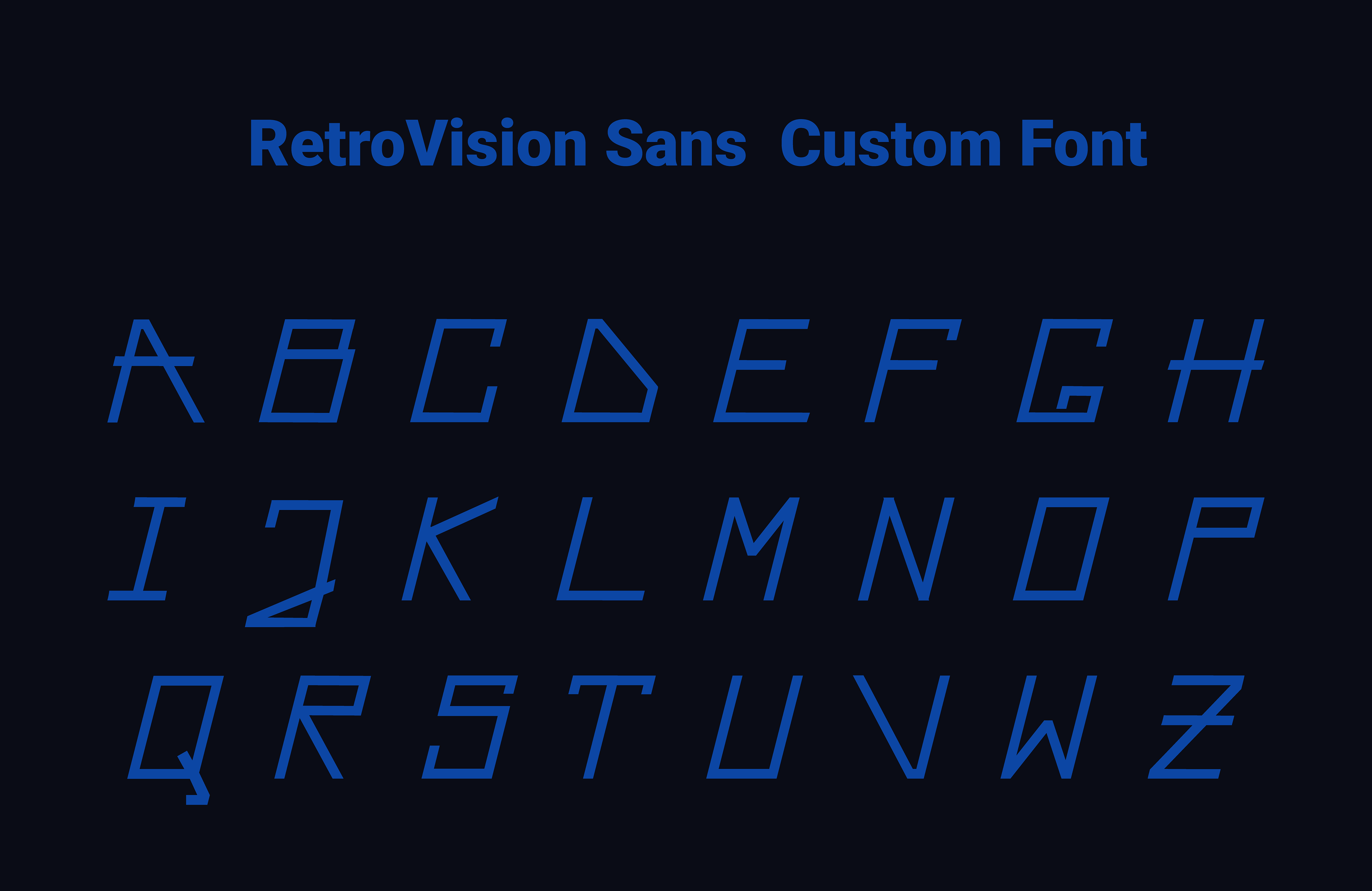
Typography
Primary Typeface: RetroVision Sans (Custom Font)
A custom uppercase typeface created specifically for the Retro Vision identity.
Designed to evoke a cinematic, vintage-inspired look while remaining clean and modern.
Used for the logotype, headlines, and key brand elements.
Designed to evoke a cinematic, vintage-inspired look while remaining clean and modern.
Used for the logotype, headlines, and key brand elements.
Character Set (Current Version):
Uppercase A–Z
Numbers and lowercase characters are planned for a future expansion.
Numbers and lowercase characters are planned for a future expansion.
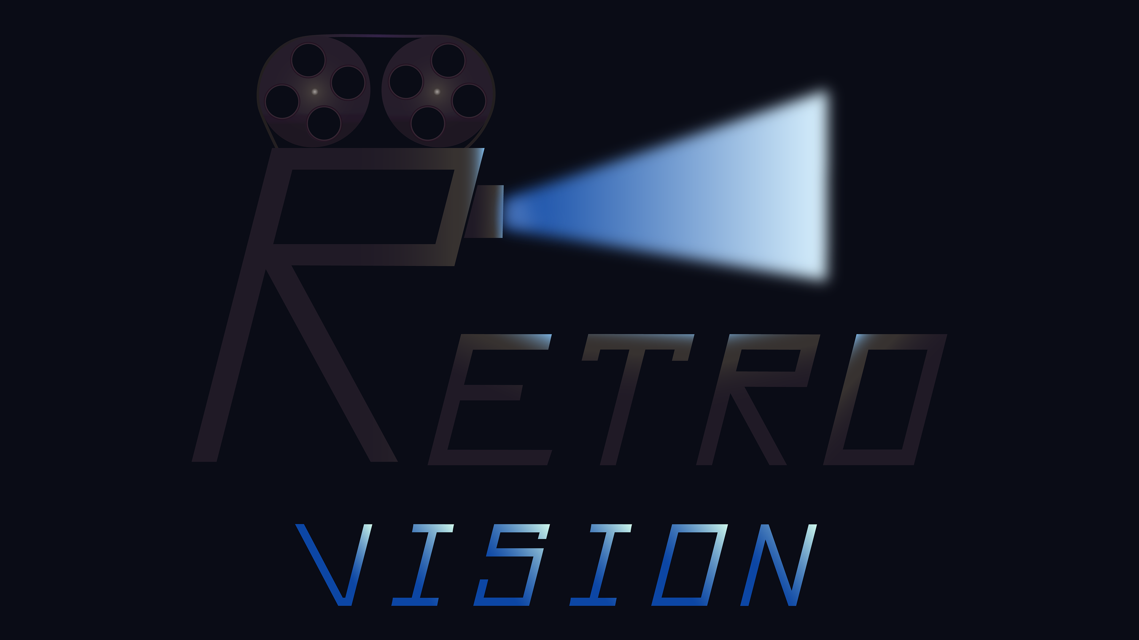
LOGO EVOLUTION
Before starting the visual design, I already knew I wanted the text itself to become part of the brand’s visual identity.
The idea of building a projector shape from the letter R came early in the process, but no existing typeface offered an R that matched the concept.
Because of this, I decided to create my own stylized R — and once the R was complete, it became clear that I needed a full custom alphabet to maintain a unified brand look.
This led to the creation of the Retro Vision Sans custom font, which then shaped the final logo, icons, and overall identity.
Initial Concept Sketch
I started by exploring the idea of turning the letter R into a vintage film projector.
This early sketch focuses on the basic silhouette: two reels, a rectangular body, and a simplified projection shape.
The goal was to test whether the R-shaped structure could visually support the concept.
This early sketch focuses on the basic silhouette: two reels, a rectangular body, and a simplified projection shape.
The goal was to test whether the R-shaped structure could visually support the concept.
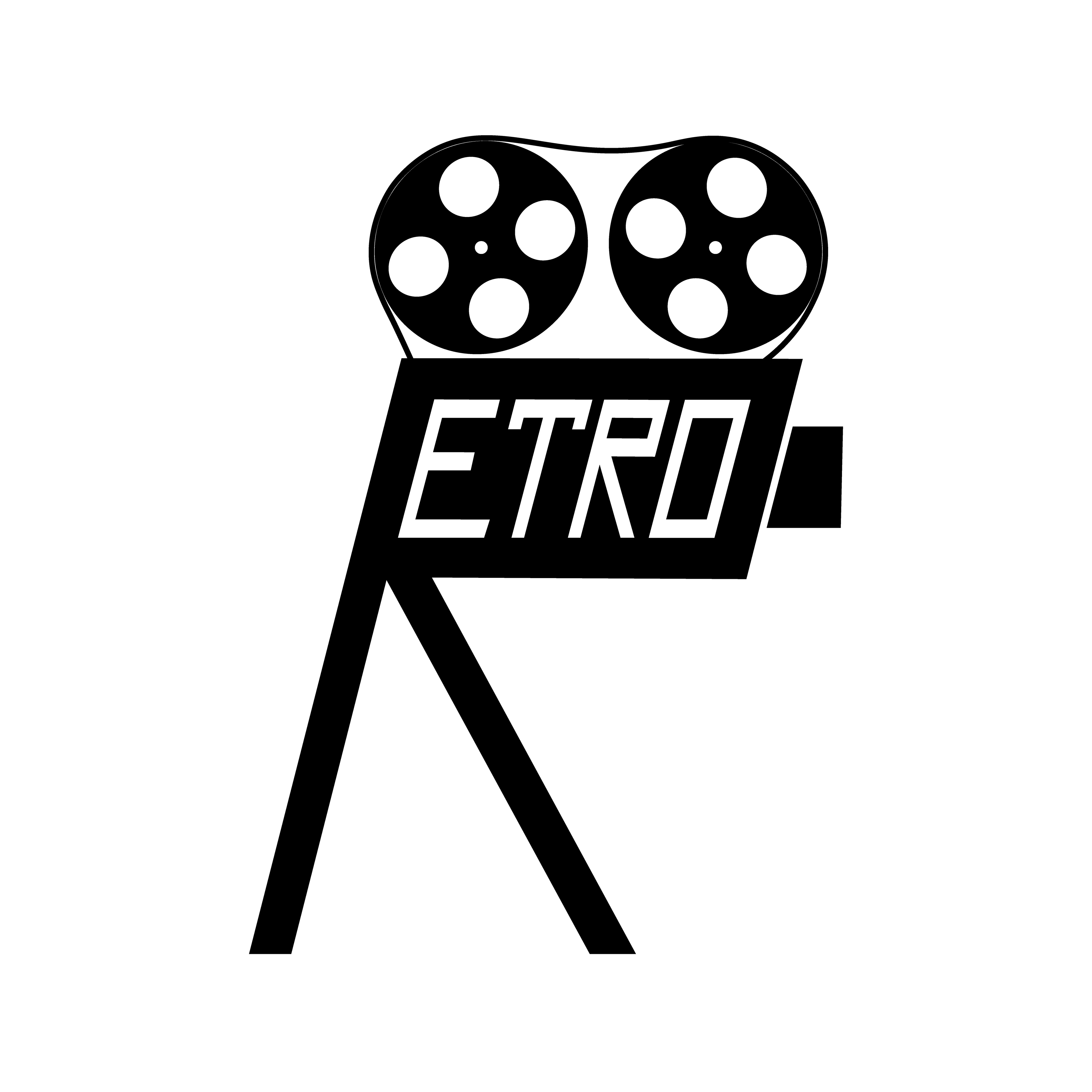
Integrating the Wordmark Into the Projector Shape
After developing the custom typeface, the next step was to merge the word “RETRO” directly into the projector silhouette.
In this early version, the letters ETRO were placed inside the projector’s body to test how the typography could structurally align with the R-shaped frame.
This confirmed that the custom font fits naturally into the visual identity and supports the concept of a unified logo built around the letter R.
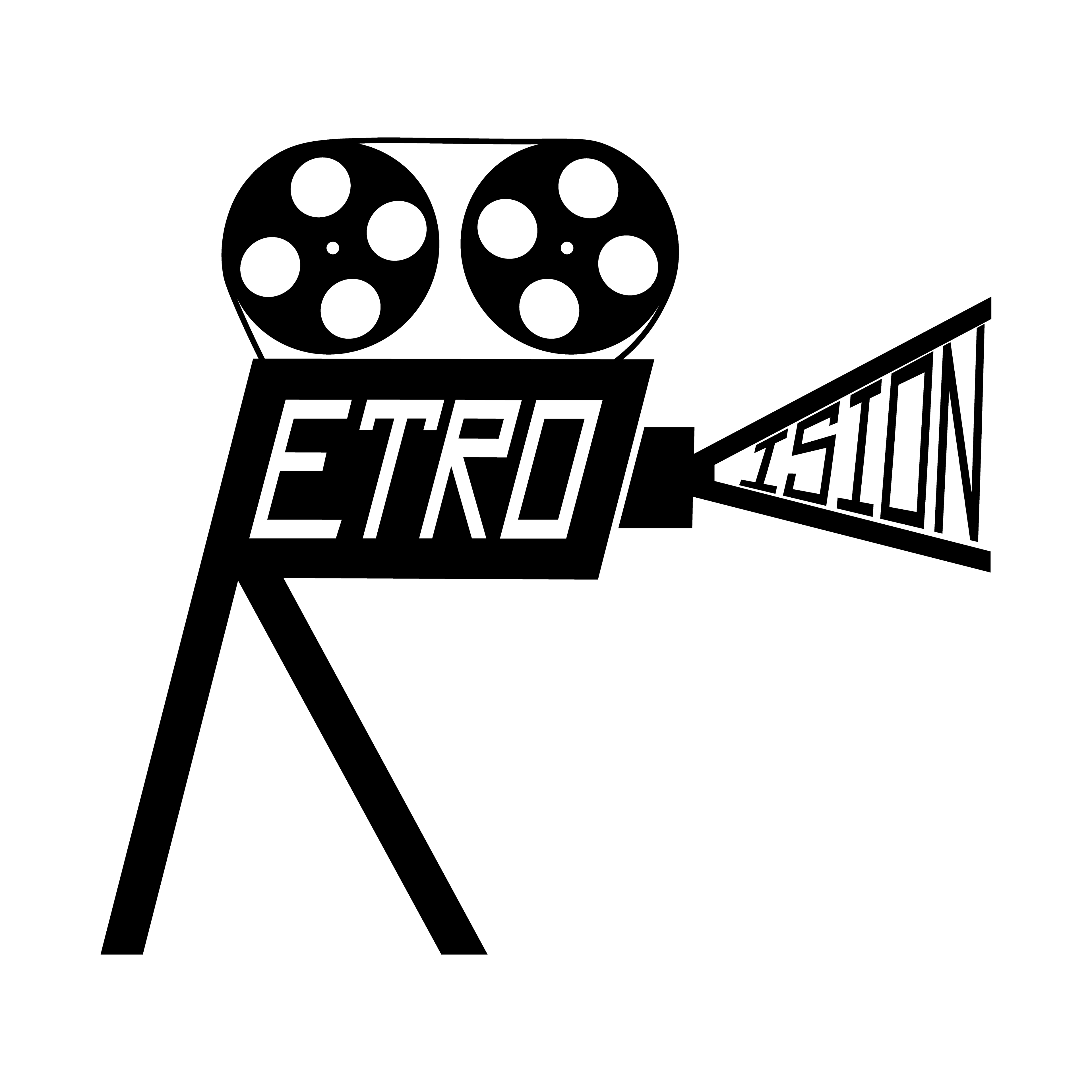
Extending the Logo With the Word VISION
To expand the logo into a complete brand name, I incorporated the word “VISION” directly into the projector’s light beam.
The idea came from using the custom typeface’s V as the structural shape of the light cone itself.
By placing ISION inside the two legs of the stylized V, the beam became both a functional element of the projector and a typographic extension of the logo.
The idea came from using the custom typeface’s V as the structural shape of the light cone itself.
By placing ISION inside the two legs of the stylized V, the beam became both a functional element of the projector and a typographic extension of the logo.
This step unified the full name Retro Vision into one coherent visual symbol.
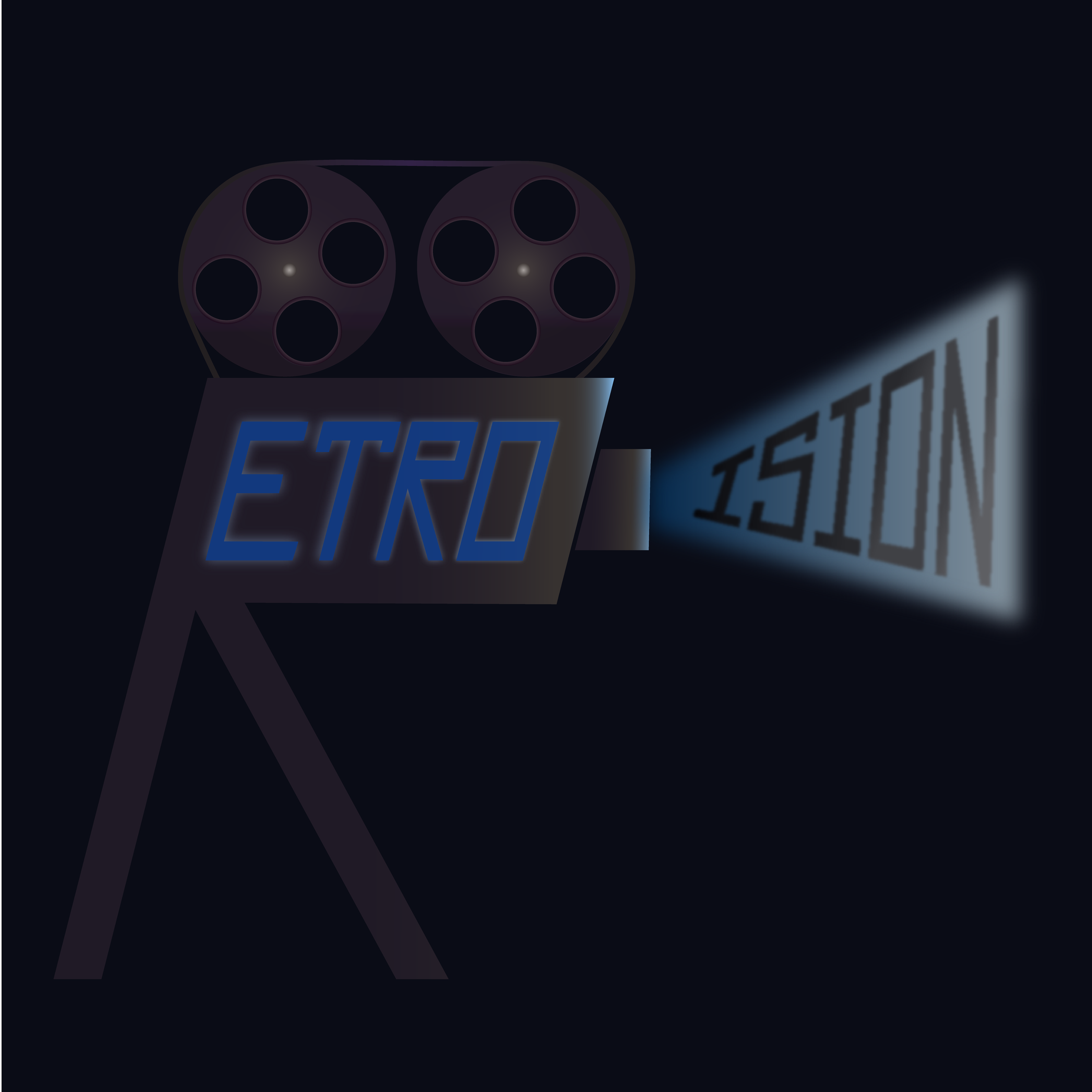
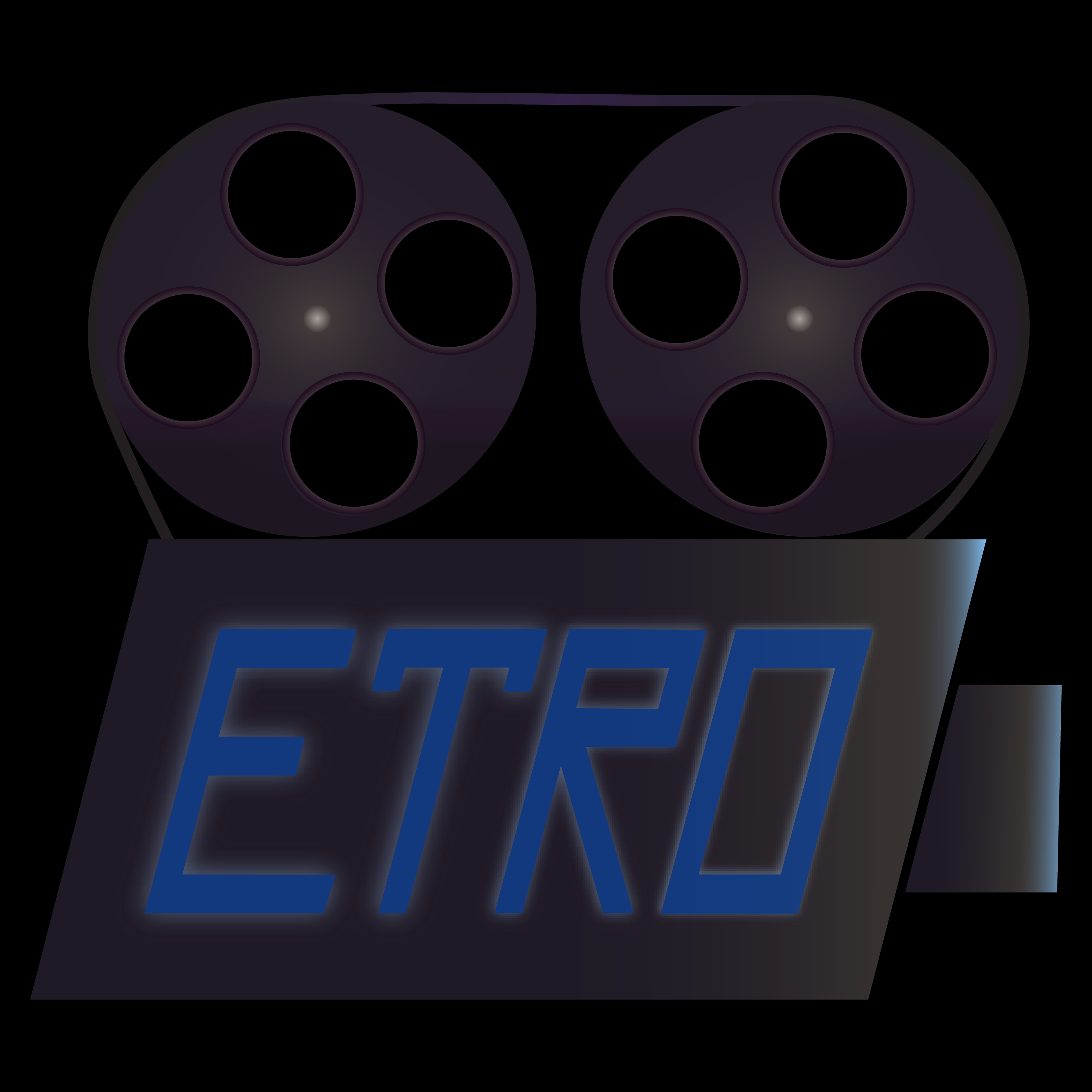
Adding Light, Depth and Atmosphere
In this stage, I moved from the flat conceptual version to a more expressive and dynamic look.
I introduced lighting effects, soft gradients and subtle shadows to give the projector a cinematic feel.
The beam of light became brighter and more realistic, while the letters inside it gained a glowing, projected texture.
This step brought the logo to life — turning the abstract concept into a visual experience that reflects the mood of Retro Vision.
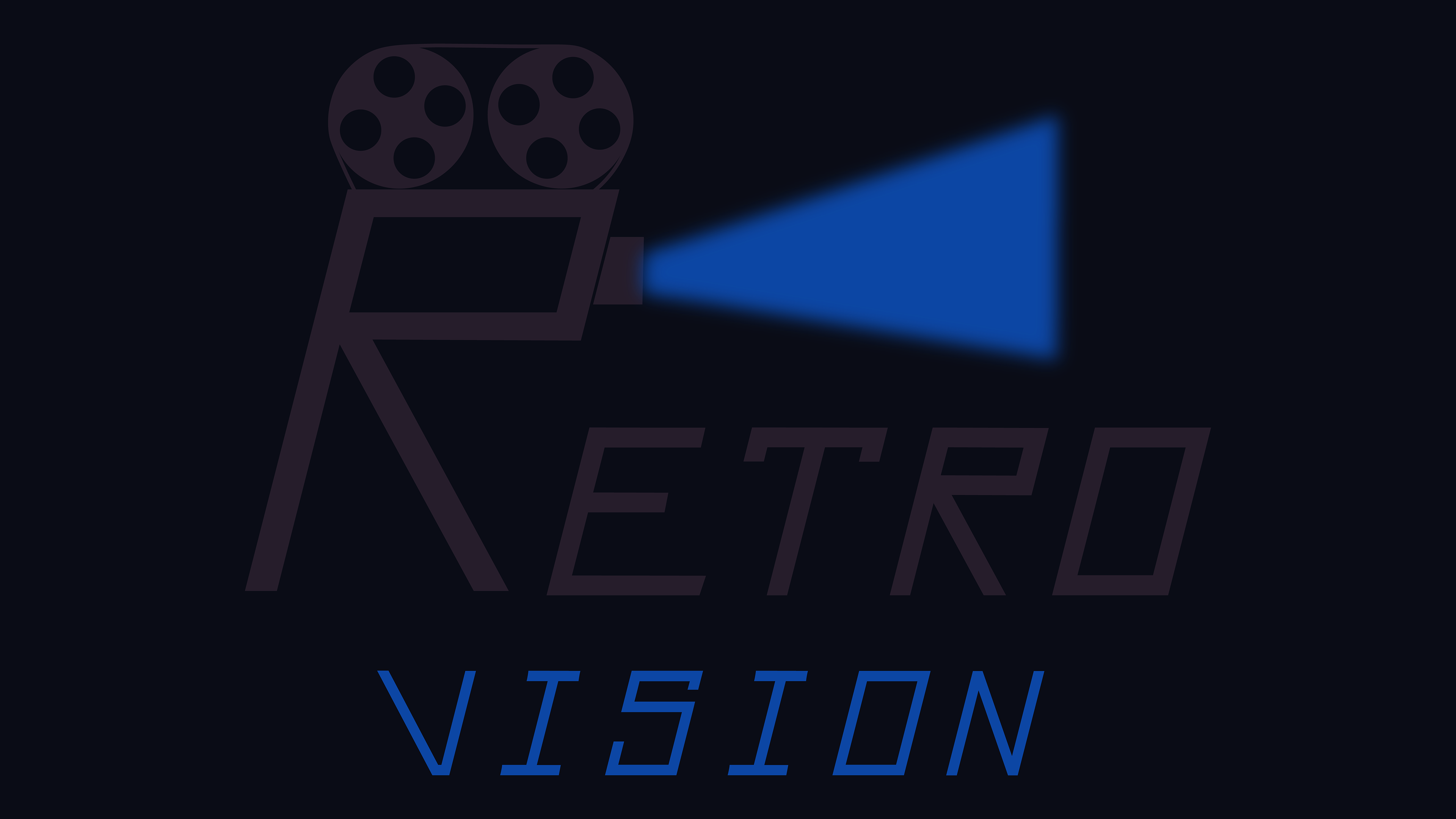
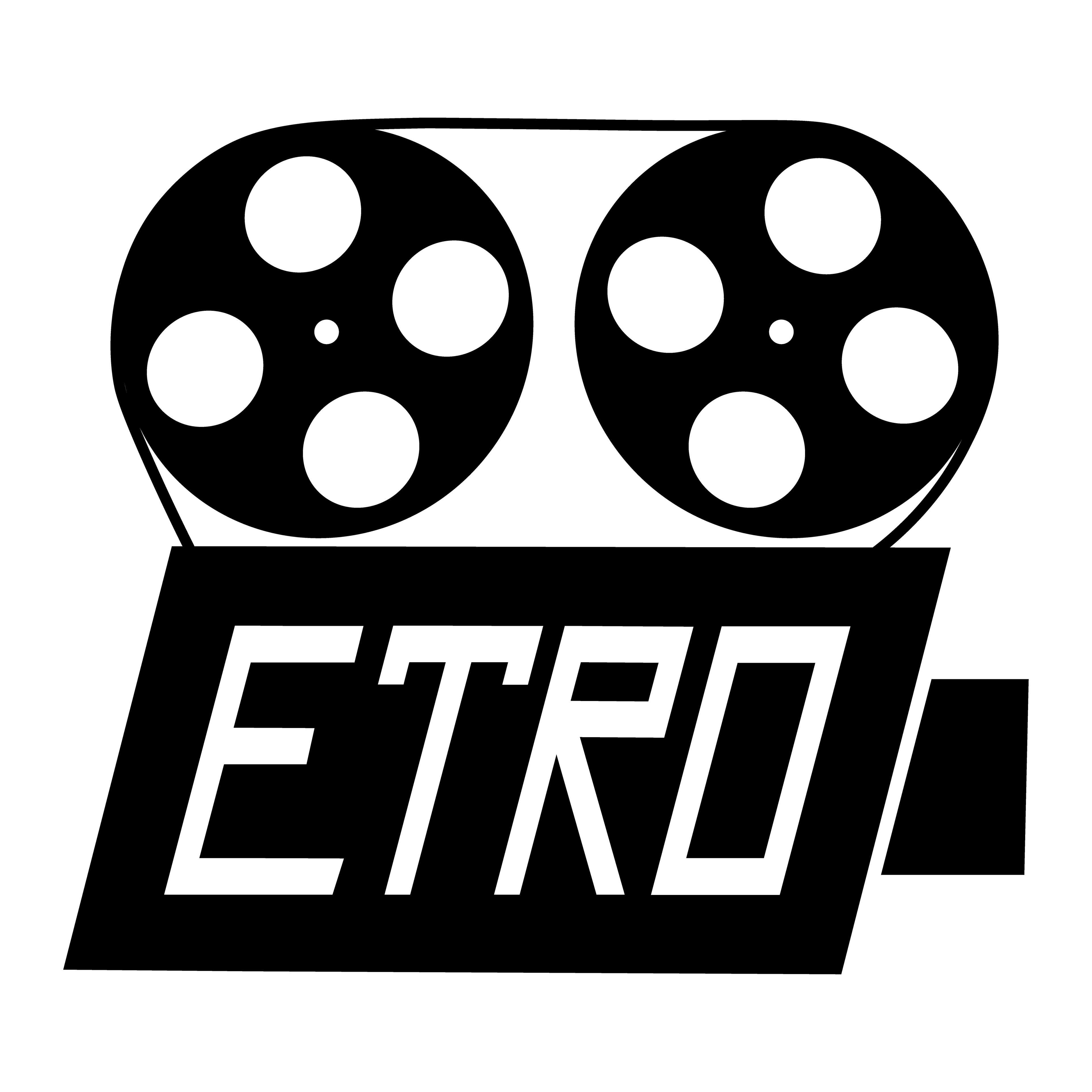
Rebalancing and Rebuilding the Layout
After completing the detailed colored version, I took a step back to evaluate the overall visual balance of the logo.
I realized that placing ETRO inside the projector body and ISION inside the light beam limited the composition and made the design feel crowded.
I realized that placing ETRO inside the projector body and ISION inside the light beam limited the composition and made the design feel crowded.
To improve clarity and hierarchy, I decided to restructure the layout:
- I removed the text from inside the shapes
- I separated the wordmark from the projector graphic
- I introduced a cleaner, more spacious arrangement
- I enlarged the custom R character to build a stronger connection between the symbol and the brand name
- The light beam became a supporting element, not the primary text container
This redesign created a more modern, readable and professional logo system while keeping the original concept intact.

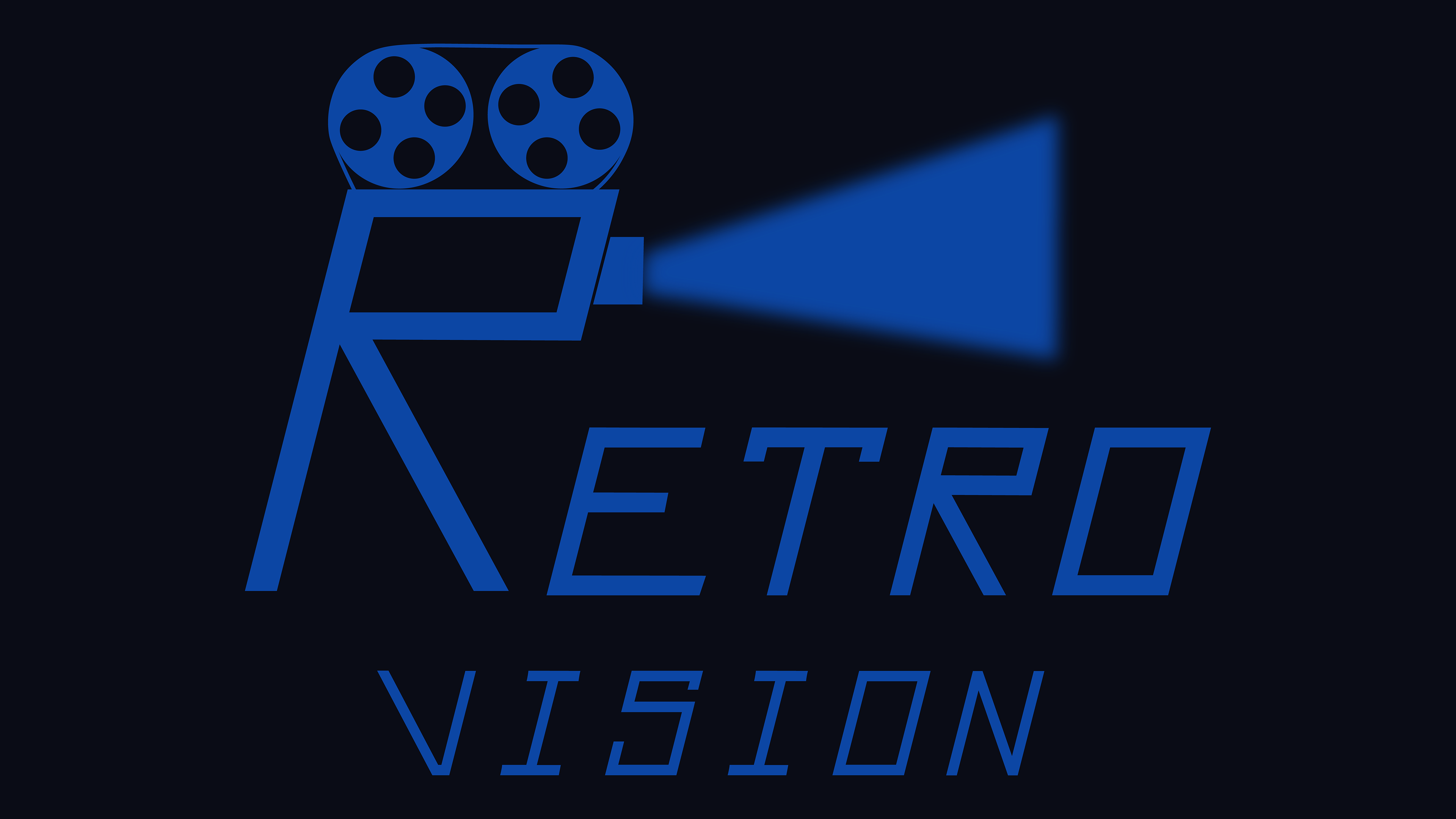
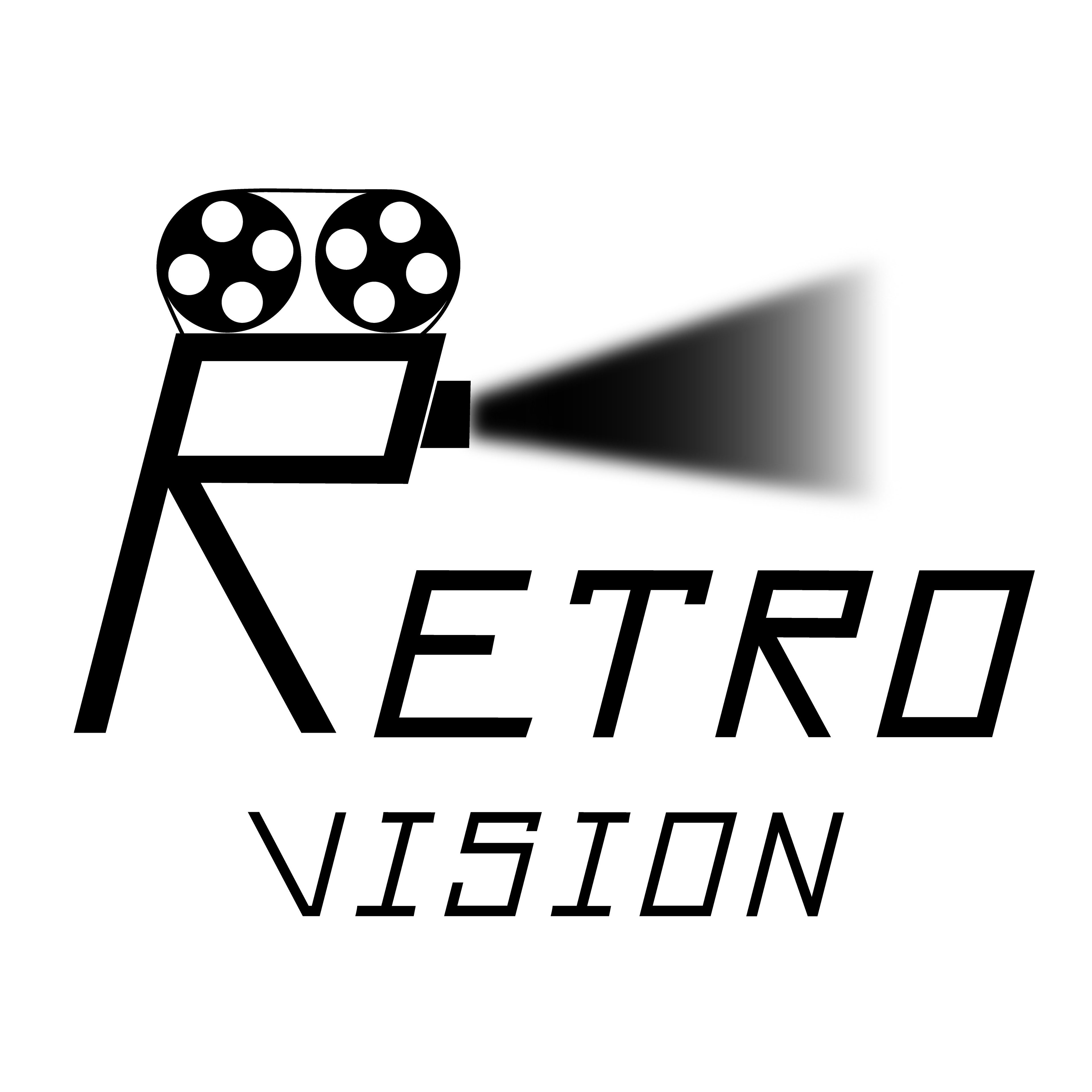
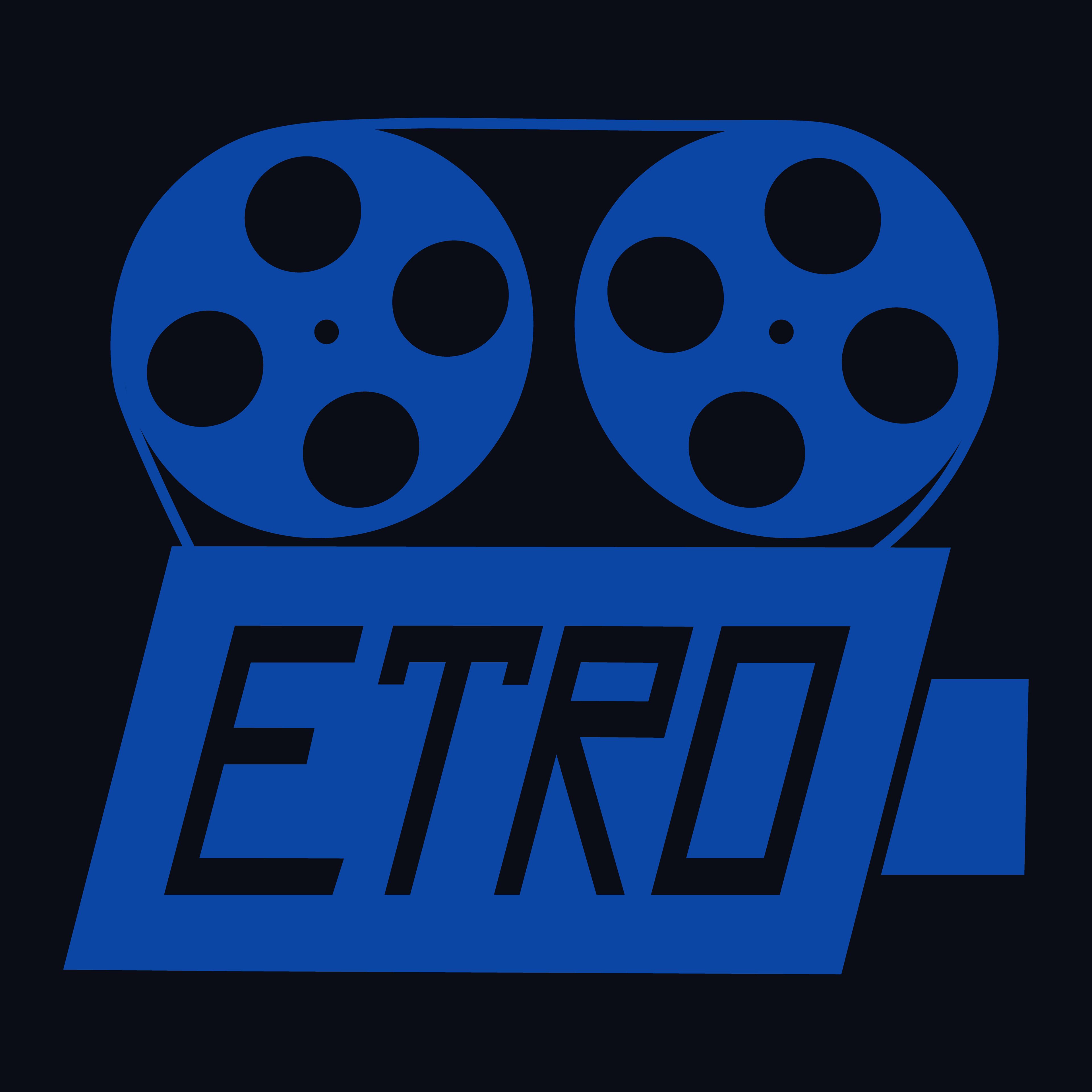
Final Overview
The redesign process gradually transformed the initial concept into a clean, modern and functional logo system.
After exploring multiple compositions, text placements and visual styles, this final version delivers the right balance between symbolism, readability and brand personality.
It captures the nostalgic feel of retro film equipment while presenting a fresh, contemporary identity for Retro Vision.
After exploring multiple compositions, text placements and visual styles, this final version delivers the right balance between symbolism, readability and brand personality.
It captures the nostalgic feel of retro film equipment while presenting a fresh, contemporary identity for Retro Vision.
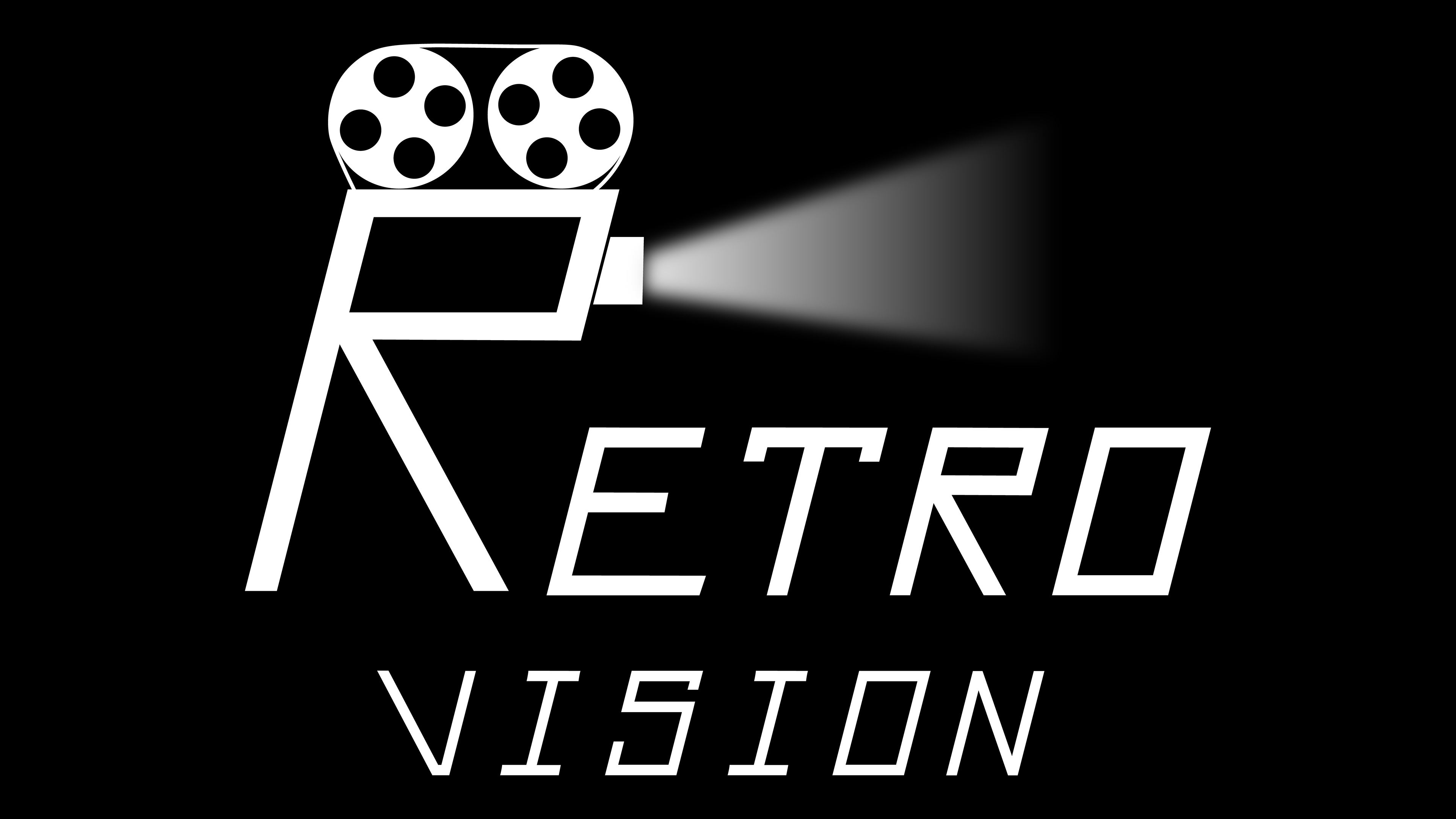
Logo Variants
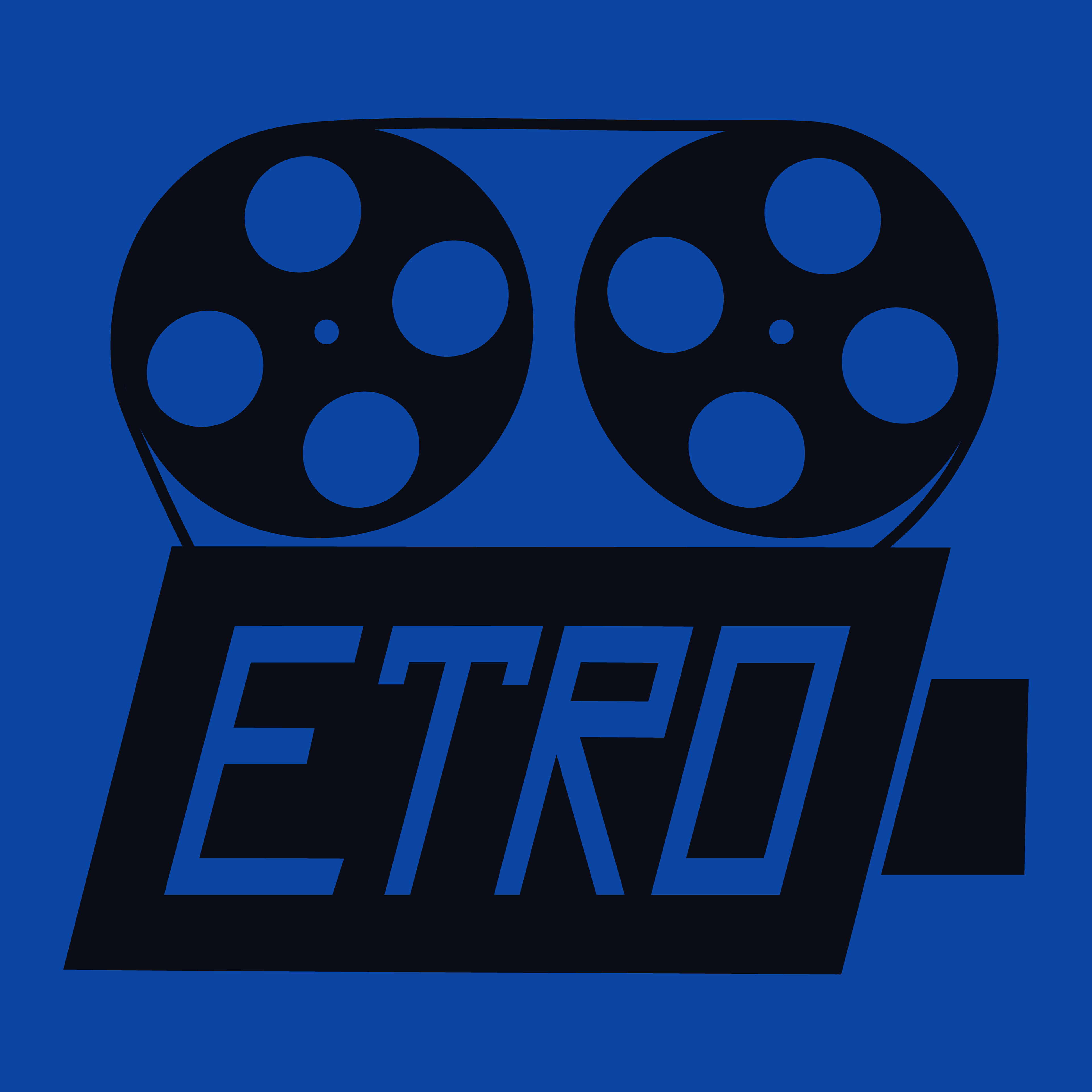
To ensure flexibility across digital and print applications, multiple logo variations were created, including colored, monochrome, and minimal icon versions
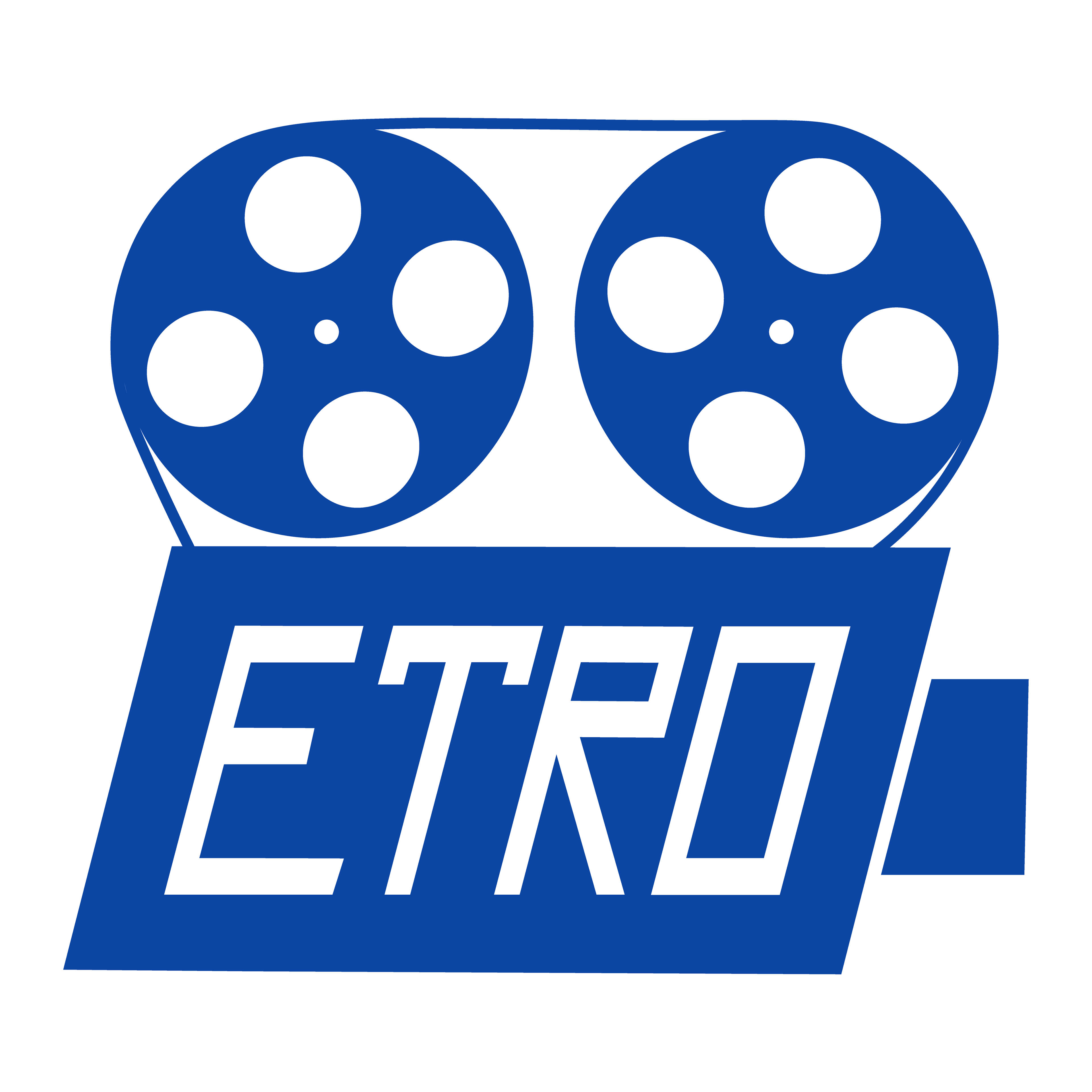
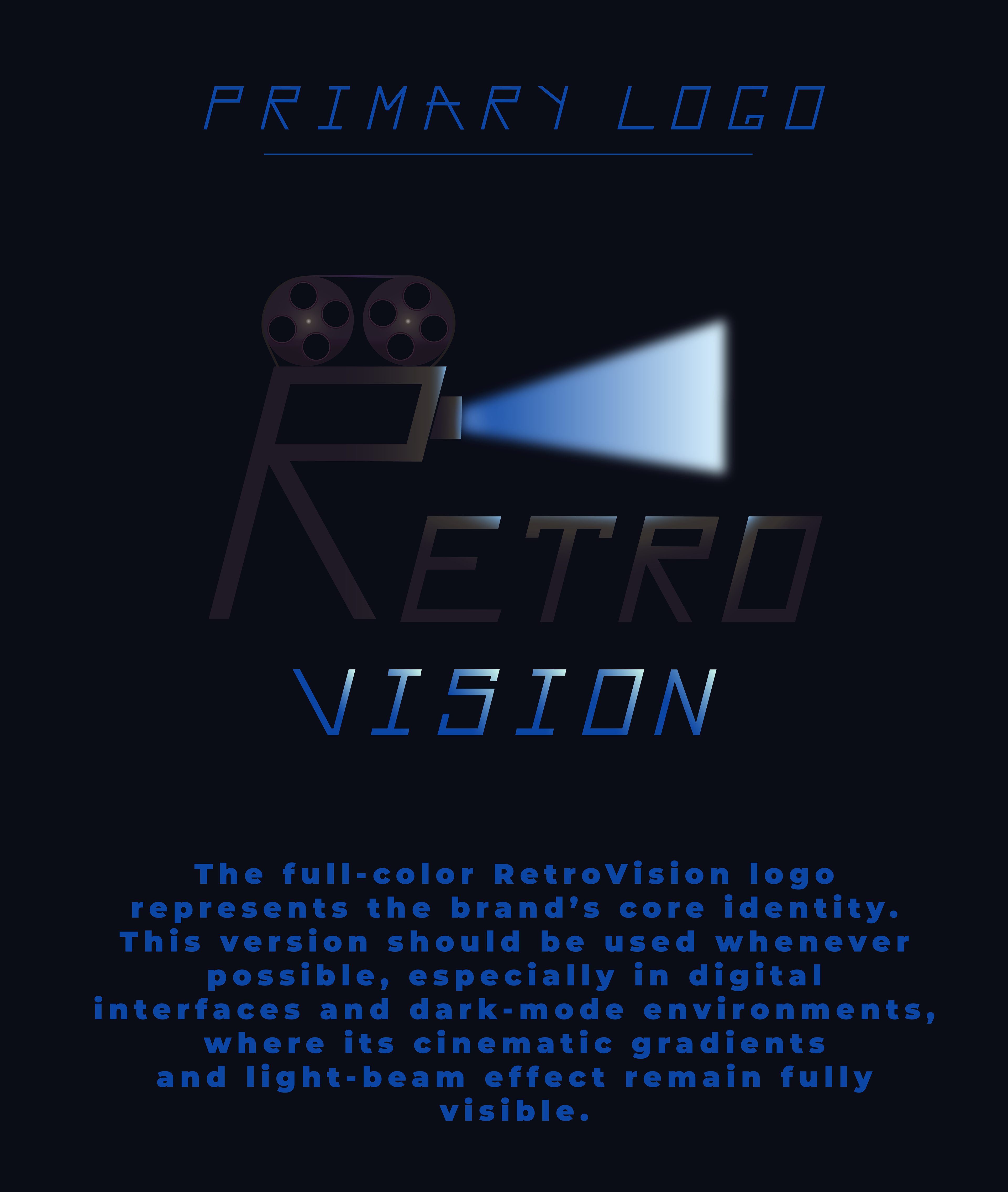
Primary Colored Logo

Flat Brand Color Version
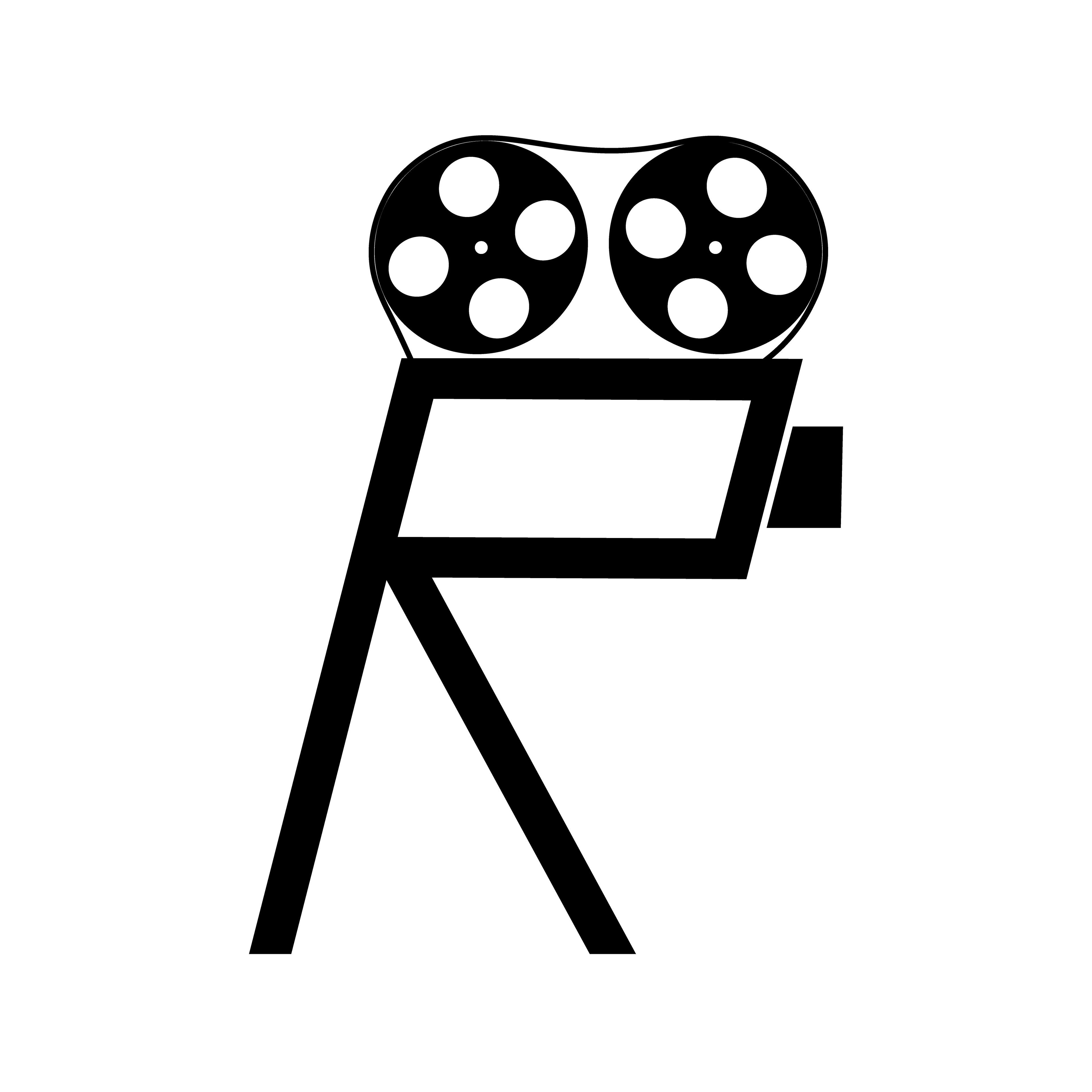
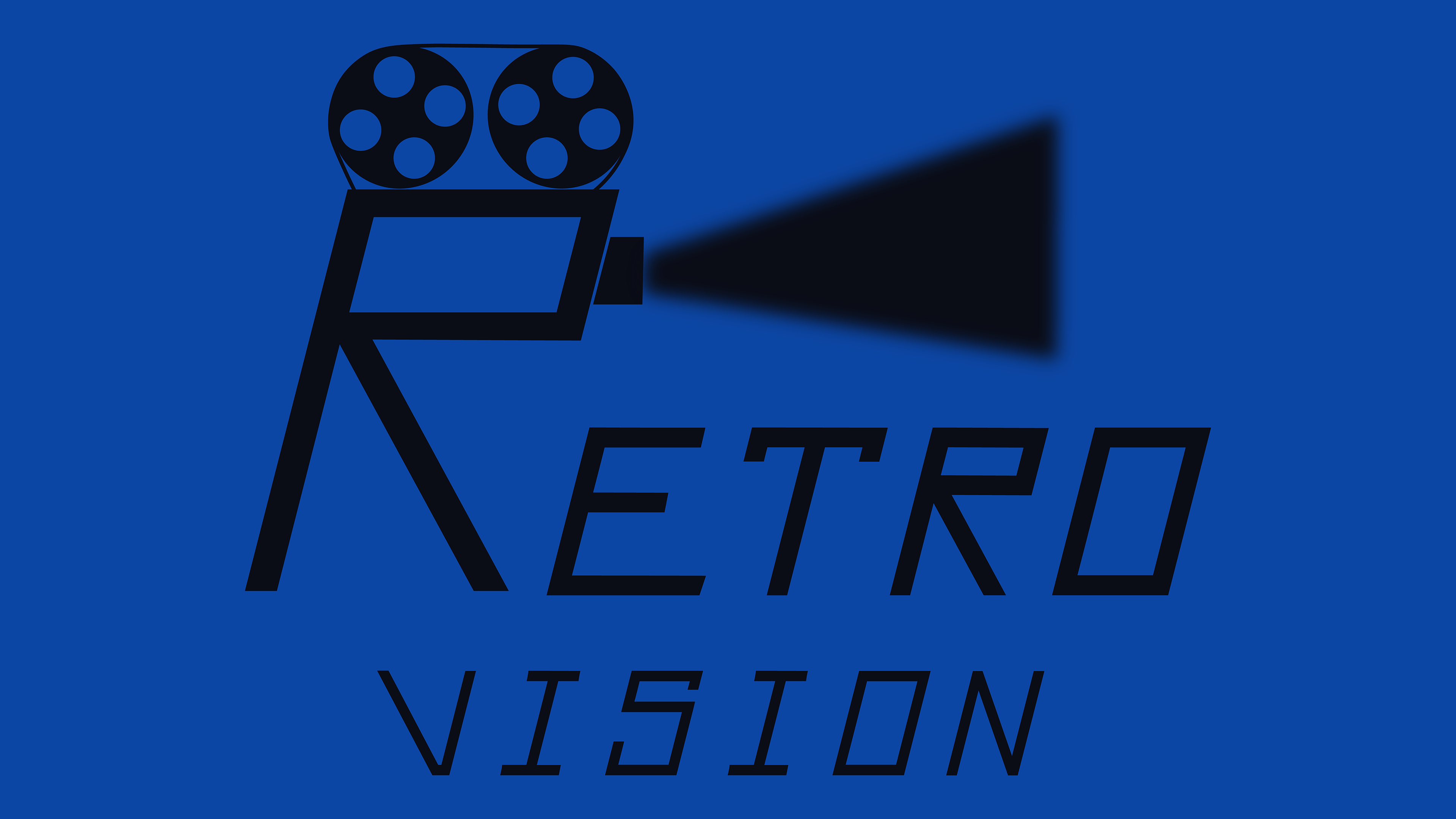
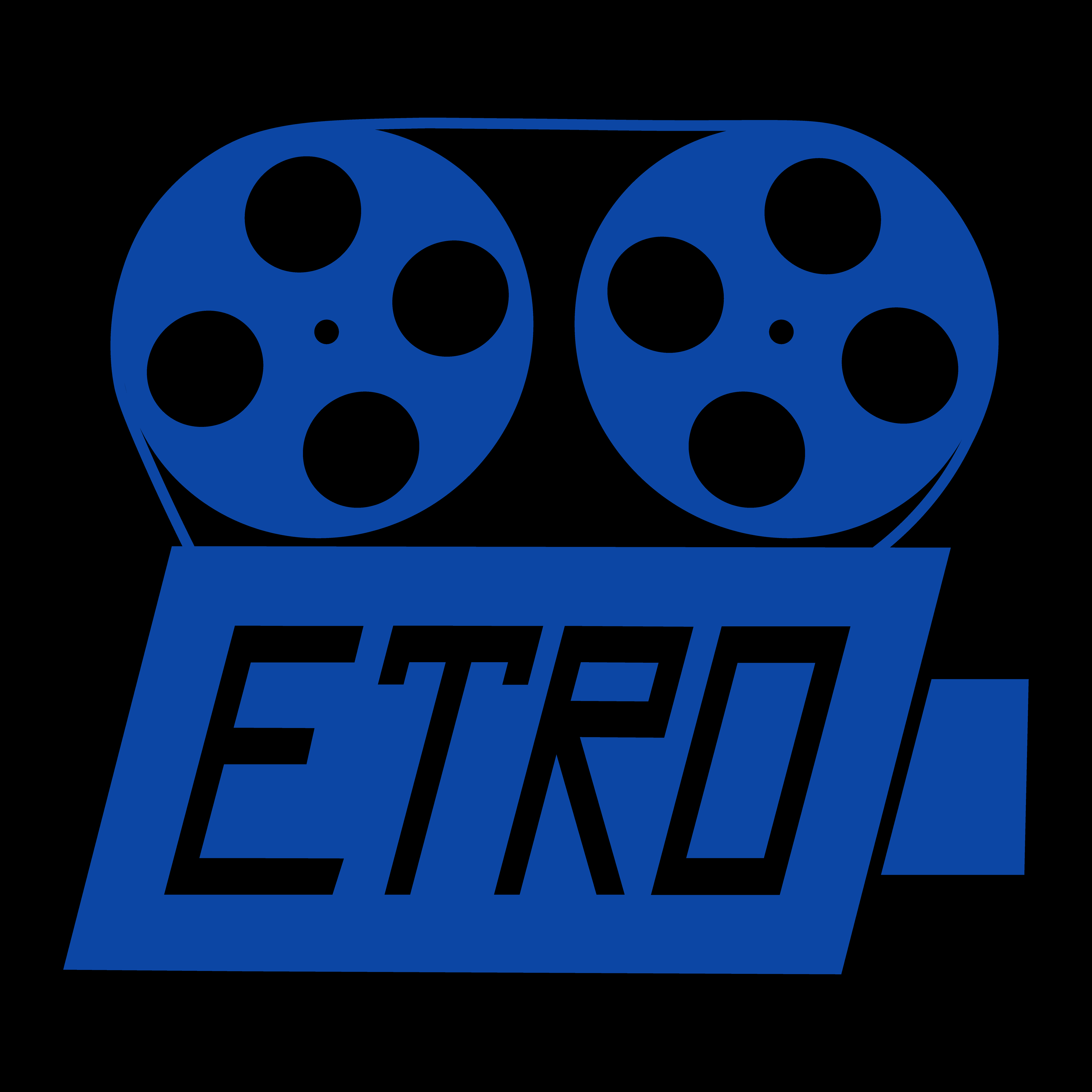
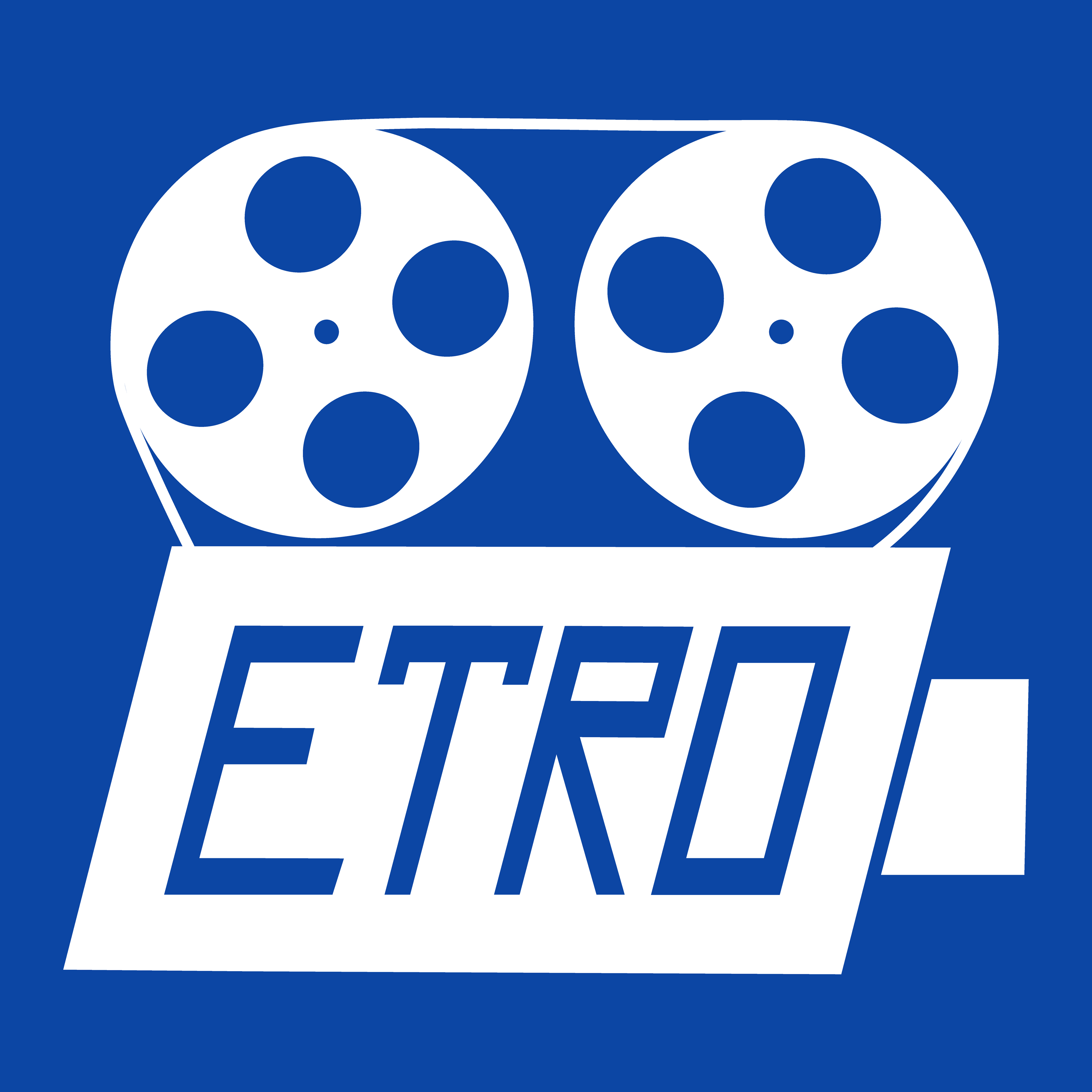
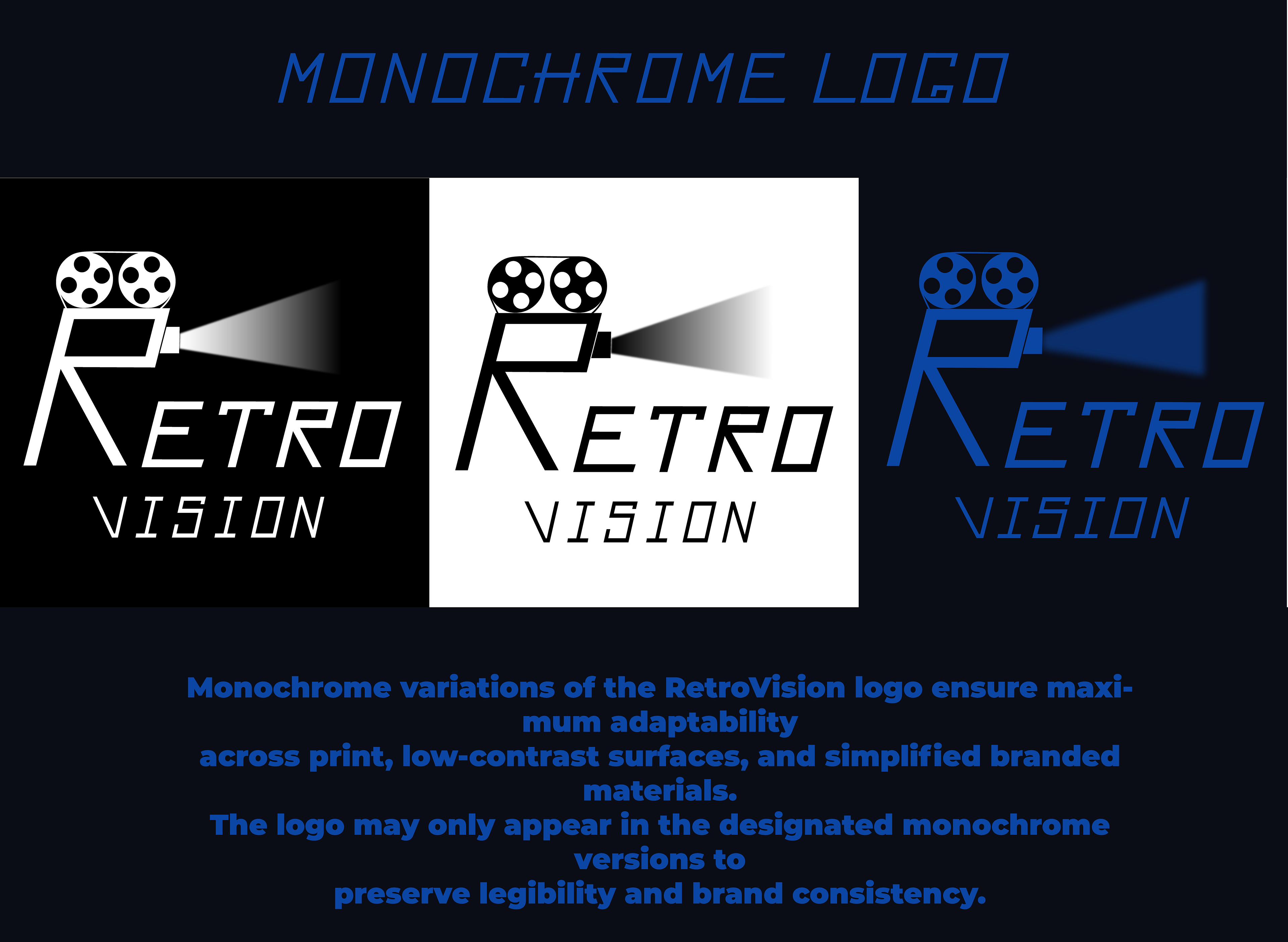
Monochrome Brand Color Versions
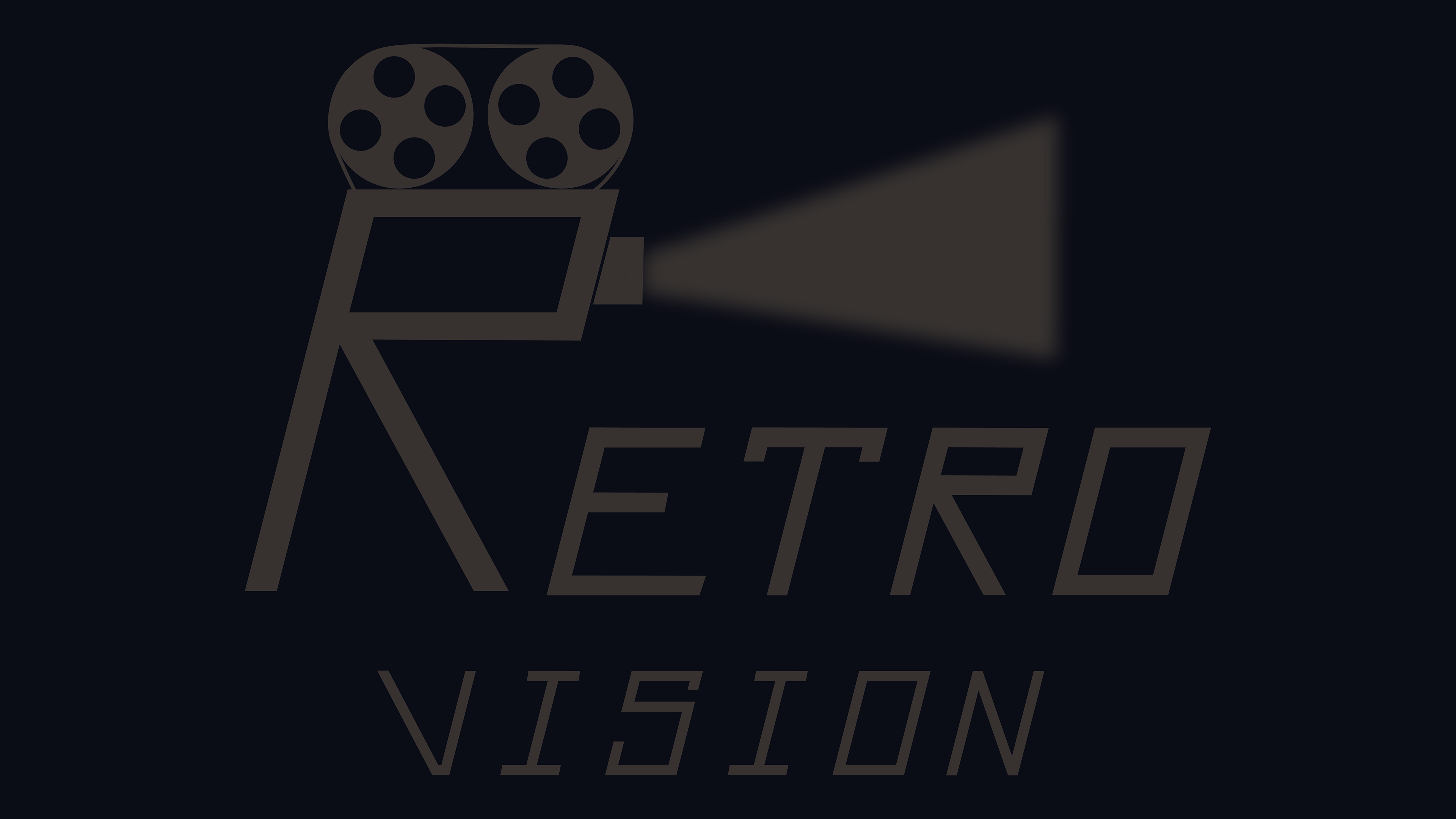
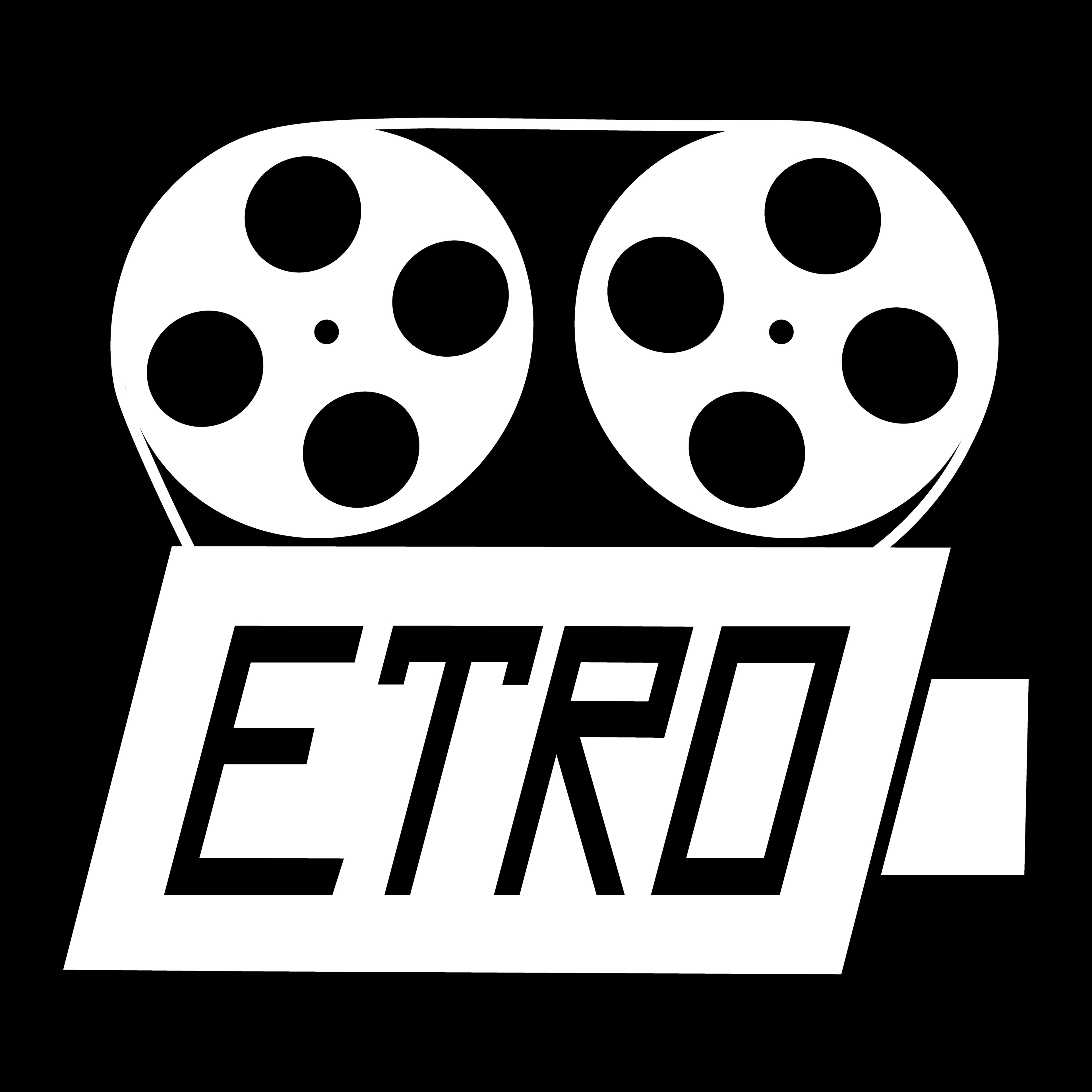
Monochrome Black version
White Monochrome Version
Square App icon Versions

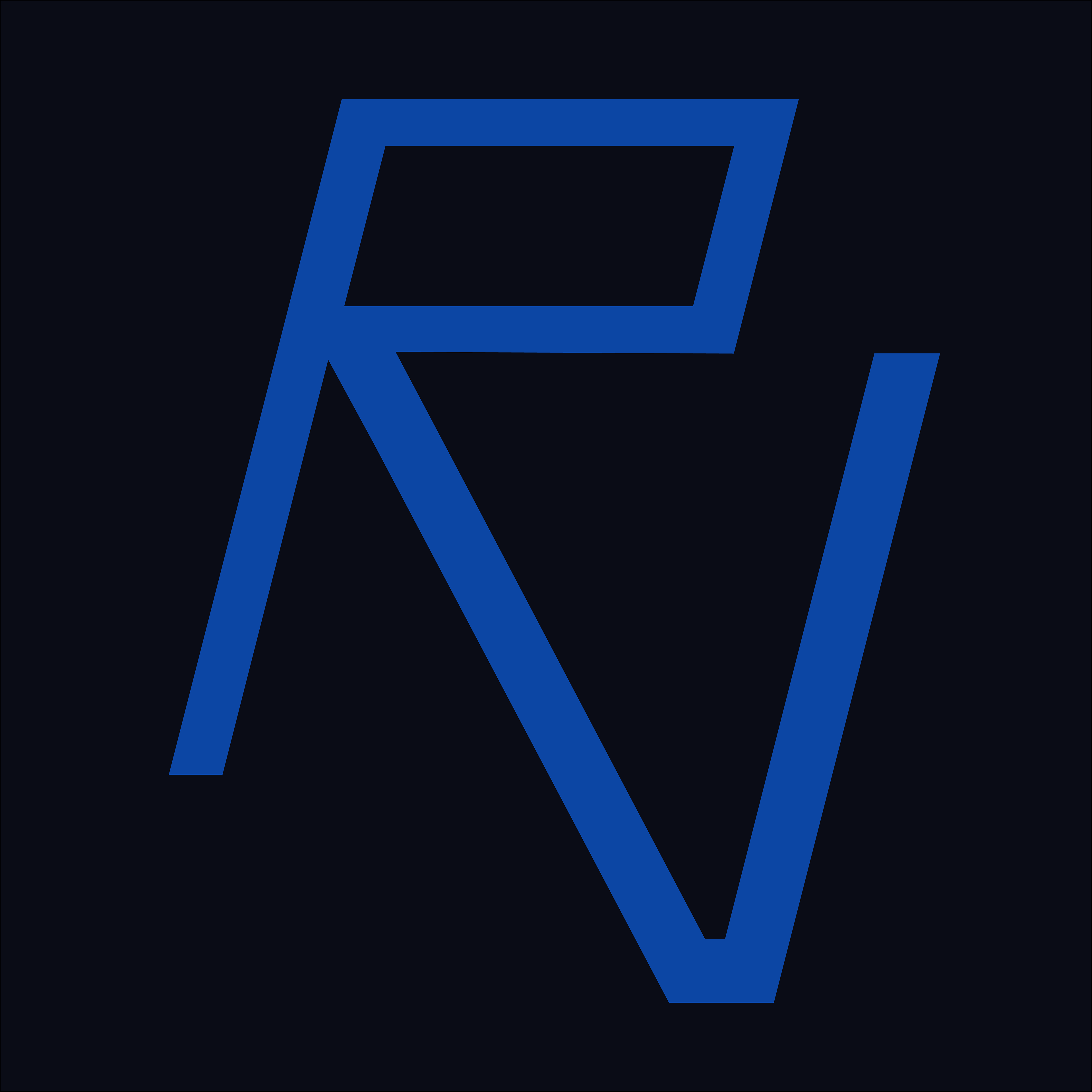
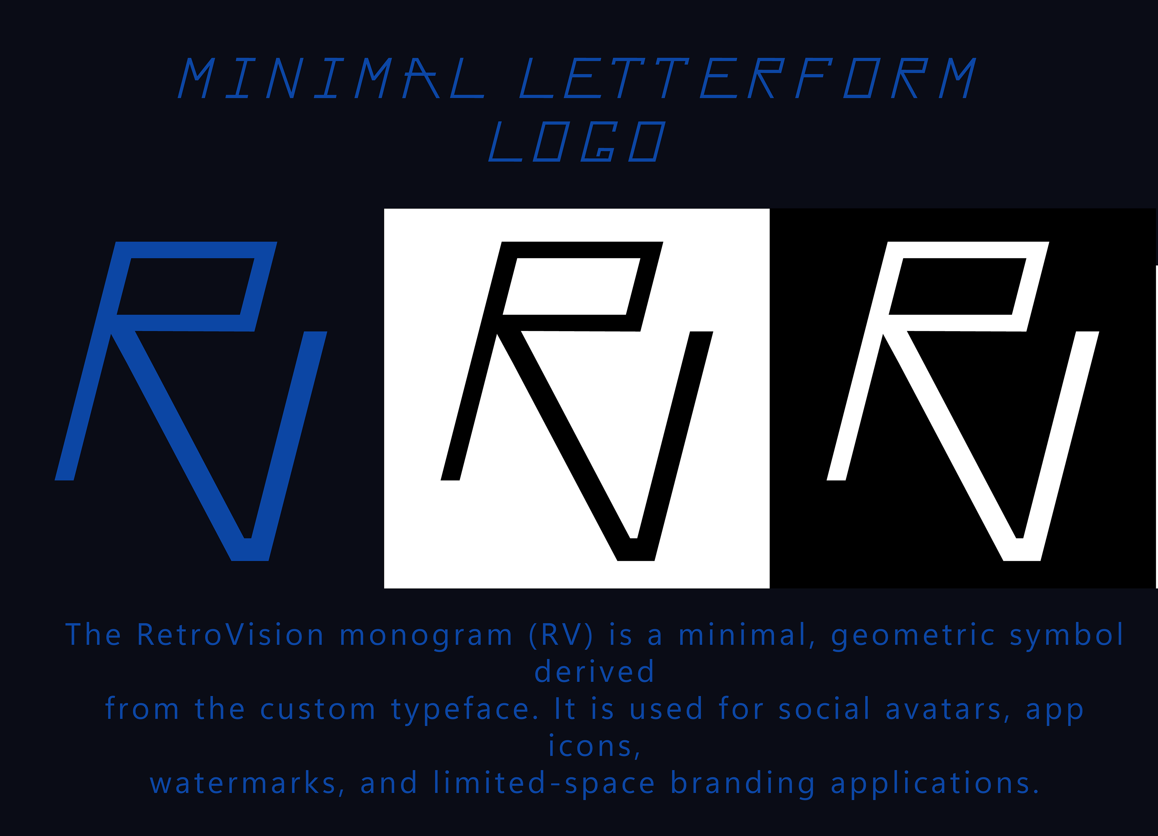
Minimal Letterform Logo
The Retro Vision monogram combines the letters R and V into a single, compact symbol built directly from the brand’s custom typeface.
Because the mark is constructed from the same geometric rules and stylistic features as the full wordmark, it maintains perfect visual consistency while delivering a strong, recognizable identity even at small sizes.
Because the mark is constructed from the same geometric rules and stylistic features as the full wordmark, it maintains perfect visual consistency while delivering a strong, recognizable identity even at small sizes.
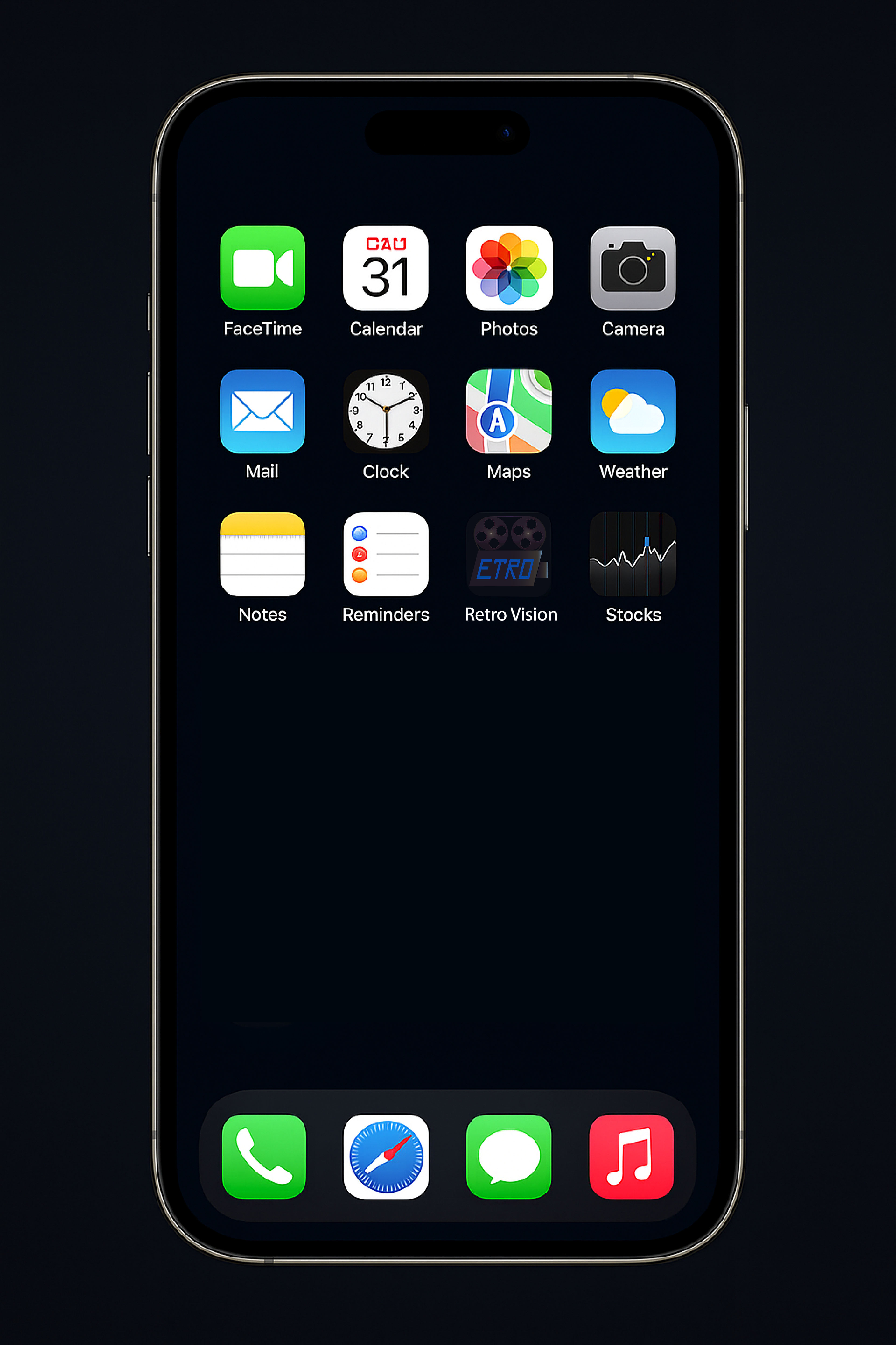
App in Context
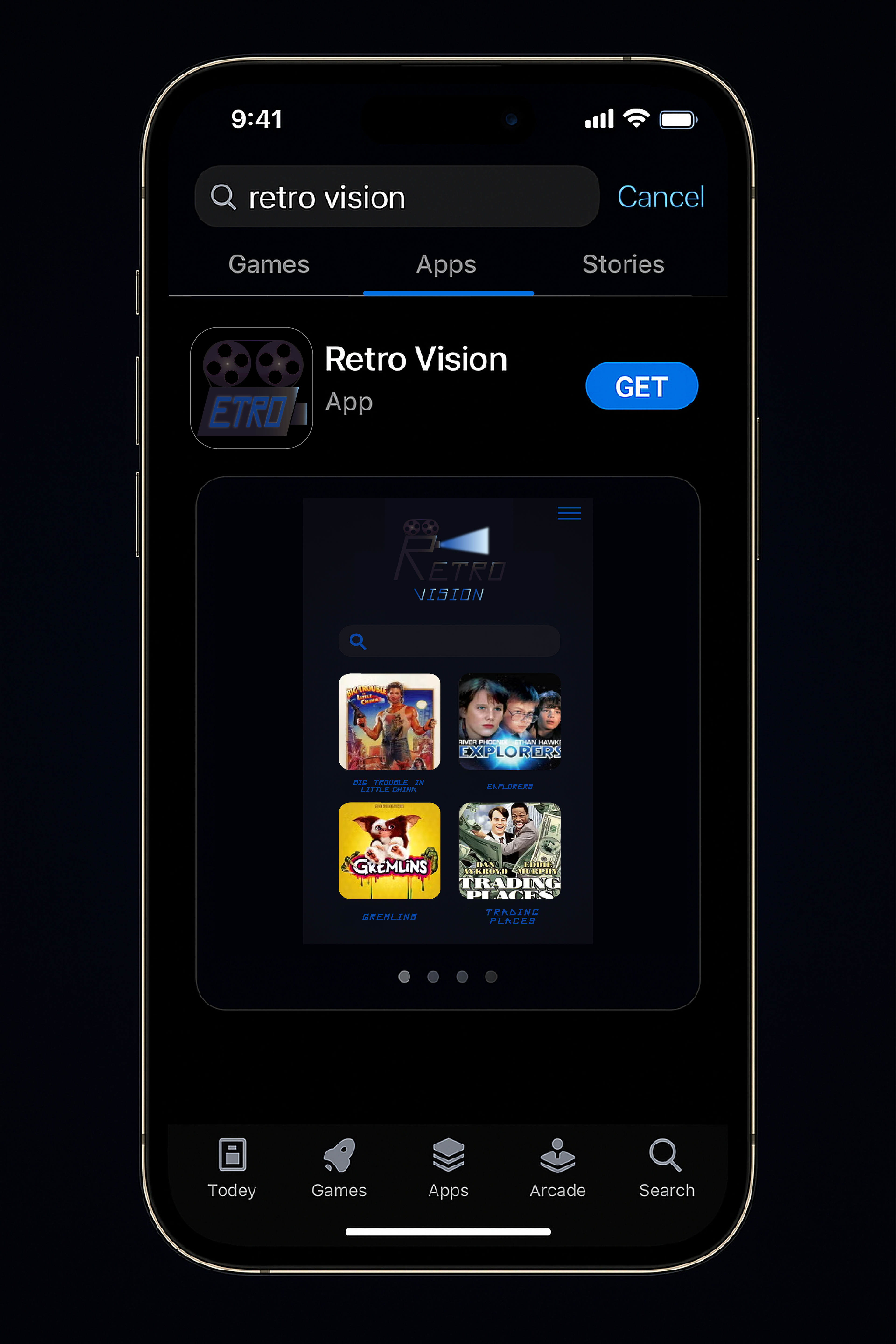
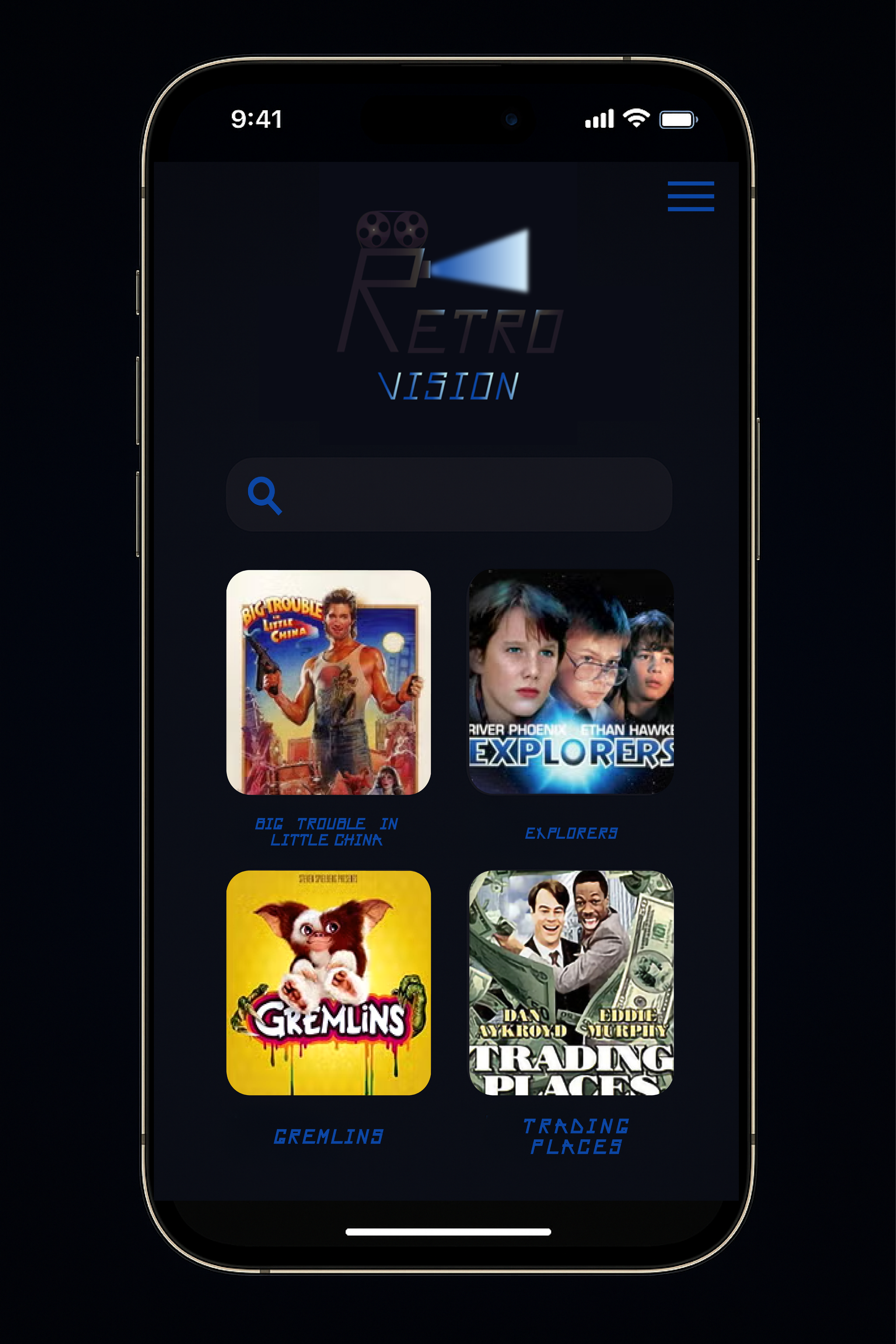
To demonstrate the logo and brand identity in a real-world context, I created several mobile mockups, including the app icon on an iPhone home screen, an App Store preview, and the first screen of the Retro Vision app.
iPhone Home Screen – App Icon
App Store Preview
In-App Screen (Homepage)
Retro Vision – Smart TV Interface Mockup
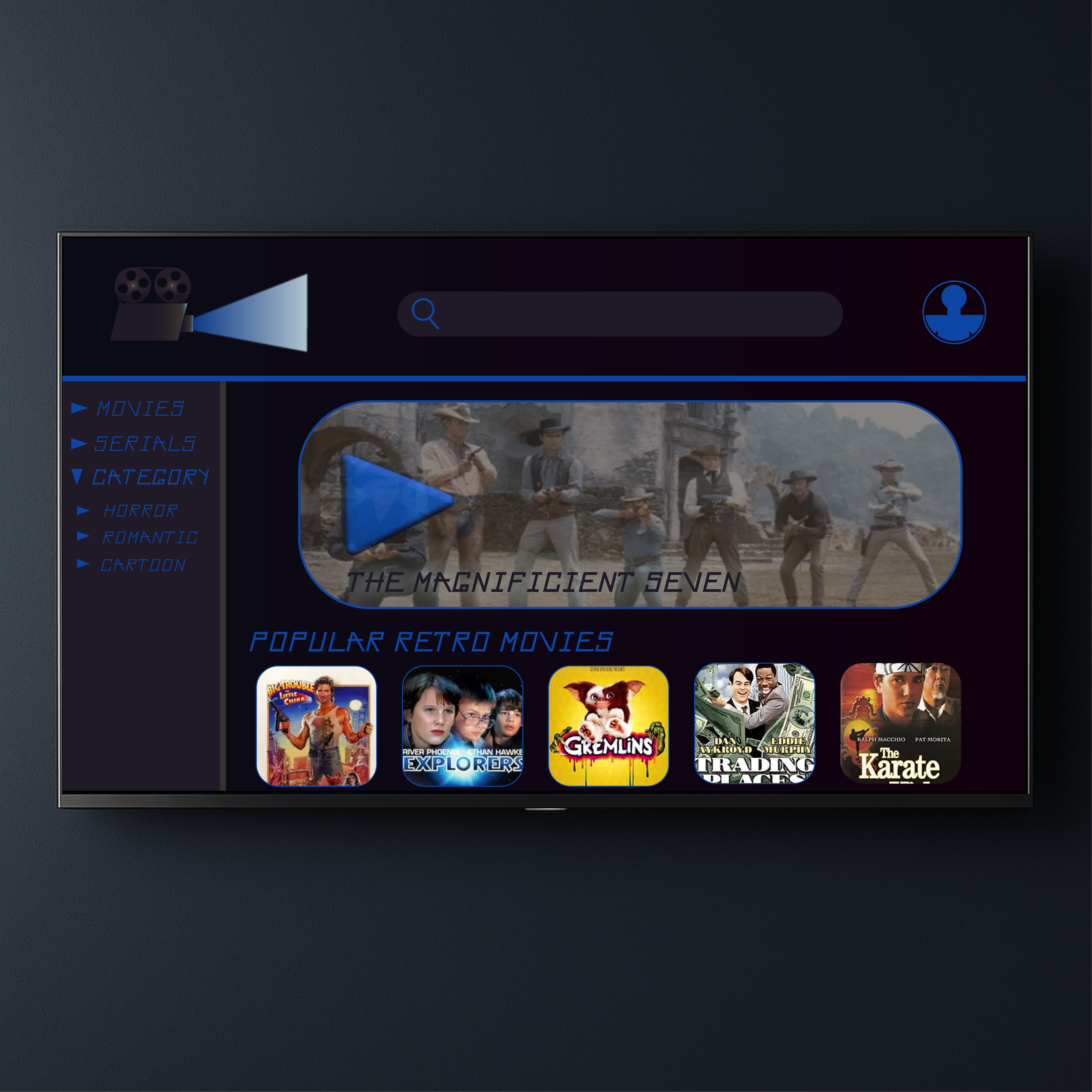
This screen showcases the TV version of the Retro Vision streaming app, designed for large displays and living-room viewing. The layout preserves the brand’s signature retro-futuristic aesthetic, using deep blues, subtle gradients, and the custom “Retro Vision Sans” typeface.
The interface prioritizes ease of navigation:
– A left-side category menu provides quick access to movies, serials, and genres.
– A large hero banner highlights featured classic films, with a prominent play button that stands out even from a distance.
– Below the banner, a curated collection of popular retro movies is displayed using rounded thumbnails inspired by vintage VHS box art.
This mockup demonstrates how the Retro Vision brand scales seamlessly to a TV environment while maintaining clarity, accessibility, and strong visual identity.