SLT – Logo Design & Vehicle Advertising Sticker
A clean and dynamic logo design created for SLT, along with vehicle advertising sticker layout.
The project includes the complete logomark construction and the final application on a real van mockup.
The project includes the complete logomark construction and the final application on a real van mockup.
1. Understanding the Client
2. Character Stylization
The electrician figure was simplified into a clean silhouette, highlighting two key features:
– the beard, symbolizing experience and trust
– the fisherman hat, his personal trademark
This created a logo that is both iconic and directly connected to the identity of the business owner.
– the beard, symbolizing experience and trust
– the fisherman hat, his personal trademark
This created a logo that is both iconic and directly connected to the identity of the business owner.
3. Adding Electrical-Themed Symbols
To represent the electrical profession clearly, two cables were integrated into the composition, forming a perfect circular shape around the main character.
They move in opposite directions, one ending in a plug, the other in a socket connector.
Both cables disappear behind the central logo element and re-emerge with sharp, dynamic tips on the opposite side, emphasizing motion and energy flow.
They move in opposite directions, one ending in a plug, the other in a socket connector.
Both cables disappear behind the central logo element and re-emerge with sharp, dynamic tips on the opposite side, emphasizing motion and energy flow.
4. Color Selection
The central element was given a light metallic gradient to symbolize stability, precision, and hard work.
The two cables were colored blue and red, each with smooth gradient transitions.
These colors represent multiple aspects of electrical systems:
– negative / positive and plus / minus in DC circuits,
– phase / neutral in AC systems.
The gradients were introduced to add subtle motion and bring the logo to life, enhancing its dynamic appearance.
Light Background Version
A clean and minimal presentation of the logo on an off-white background.
Logo Construction Grid
The construction grid highlights the geometric foundation of the emblem.
Circular proportions, radial balance, and precise alignment ensure that every element—from the electrician silhouette to the plug and socket—fits into a cohesive, mathematically structured system.
This grid demonstrates the logo’s symmetry, consistency, and technical precision, reinforcing its professional and engineered character.
Workwear Application
A real-world mockup demonstrating how the SLT emblem appears on professional electrician uniforms.
The logo maintains clarity, contrast, and strong visual presence even in practical environments.
The logo maintains clarity, contrast, and strong visual presence even in practical environments.
Wordmark Design – SLT
The SLT wordmark was designed as an active, directional visual element rather than a static text.
Each letter contributes to a unified forward motion, creating an energetic flow that aligns with the brand’s electrical identity.
Each letter contributes to a unified forward motion, creating an energetic flow that aligns with the brand’s electrical identity.
– S features a blue gradient symbolizing stability and the “cold” electrical pole.
– L transitions into a metallic tone, forming a neutral bridge between the two poles.
– T extends into a sharp, angular form, completing the dynamic arrow shape.
– L transitions into a metallic tone, forming a neutral bridge between the two poles.
– T extends into a sharp, angular form, completing the dynamic arrow shape.
Together, the three letters form a single directional arrow, subtly pointing toward the emblem and emphasizing energy, movement, and precision.
This makes the wordmark not just a name, but an important part of the brand’s visual language.
This makes the wordmark not just a name, but an important part of the brand’s visual language.
Combined Logo System – Detailed Explanation
The final brand signature is created by combining the SLT wordmark with the circular electrician emblem, forming a cohesive and dynamic visual identity.
The wordmark, built from the stylized S–L–T letters, acts as a directional force.
Its internal gradient flow (blue → metallic → red) mirrors the polarity of electrical systems, while the slanted geometry of the letters produces a subtle forward-moving momentum.
This motion naturally guides the viewer’s eye toward the emblem.
Its internal gradient flow (blue → metallic → red) mirrors the polarity of electrical systems, while the slanted geometry of the letters produces a subtle forward-moving momentum.
This motion naturally guides the viewer’s eye toward the emblem.
The emblem, constructed from the personalized electrician silhouette and the two opposing energy arcs, completes the movement started by the wordmark.
The circular rotation of the cables connects visually with the arrow-like direction of the wordmark, creating a sense of continuous energy flow around the entire logo system.
The circular rotation of the cables connects visually with the arrow-like direction of the wordmark, creating a sense of continuous energy flow around the entire logo system.
One of the strongest aspects of this configuration is its perfect bilateral symmetry in usability:
the emblem can be placed either to the left or to the right of the wordmark without disturbing balance, proportions, or reading direction.
This dual-orientation compatibility makes the logo highly adaptable for real-world applications — especially vehicle branding, where the layout must work efficiently on both sides of a van.
This dual-orientation compatibility makes the logo highly adaptable for real-world applications — especially vehicle branding, where the layout must work efficiently on both sides of a van.
Together, the wordmark and emblem form a unified brand identity that expresses motion, energy, expertise, and personality.
Light Background Version — Variation
An alternative light-background layout with asymmetrical positioning.
The extended white space highlights the clean geometry of the SLT wordmark and emblem, creating a modern and premium presentation.
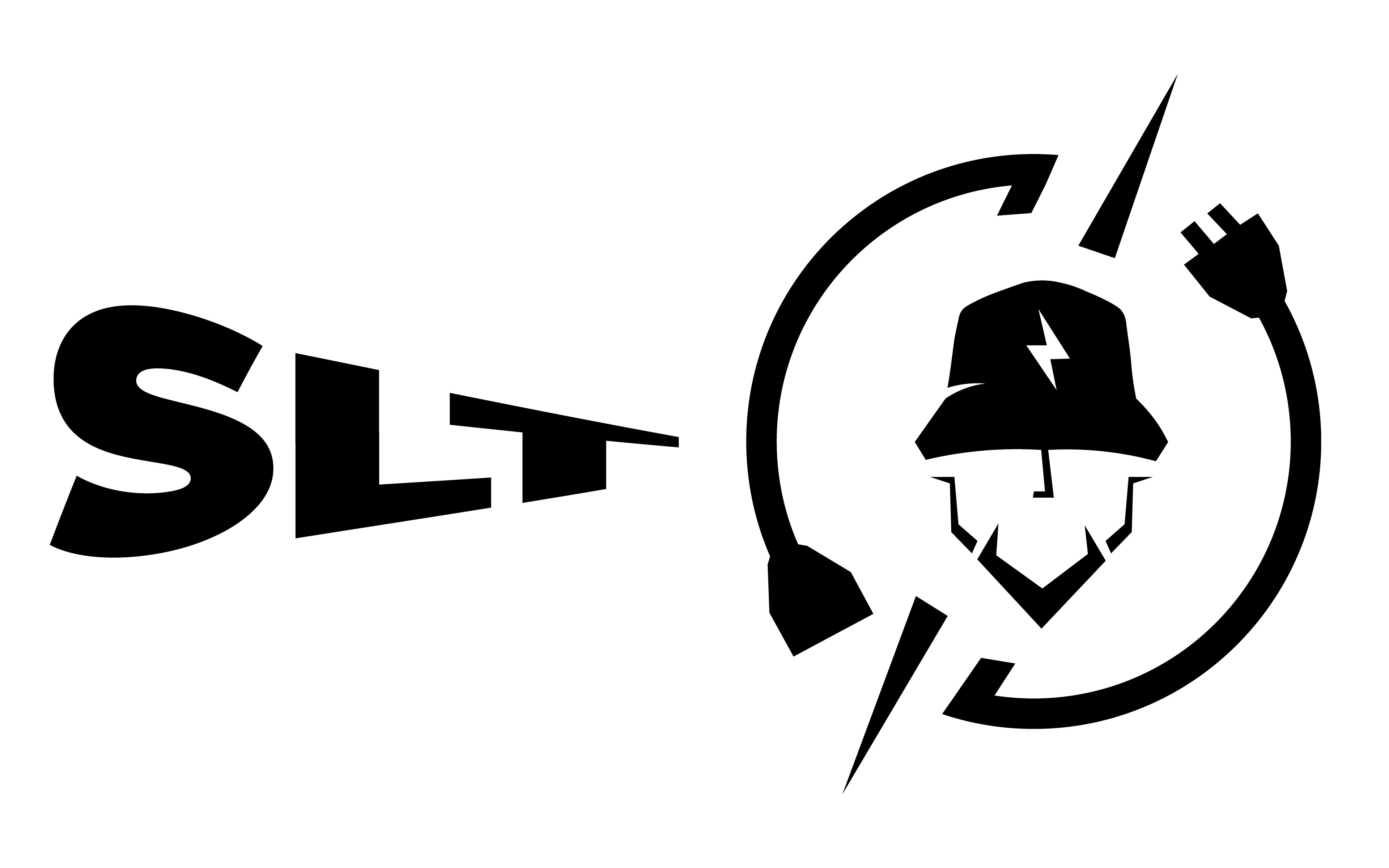
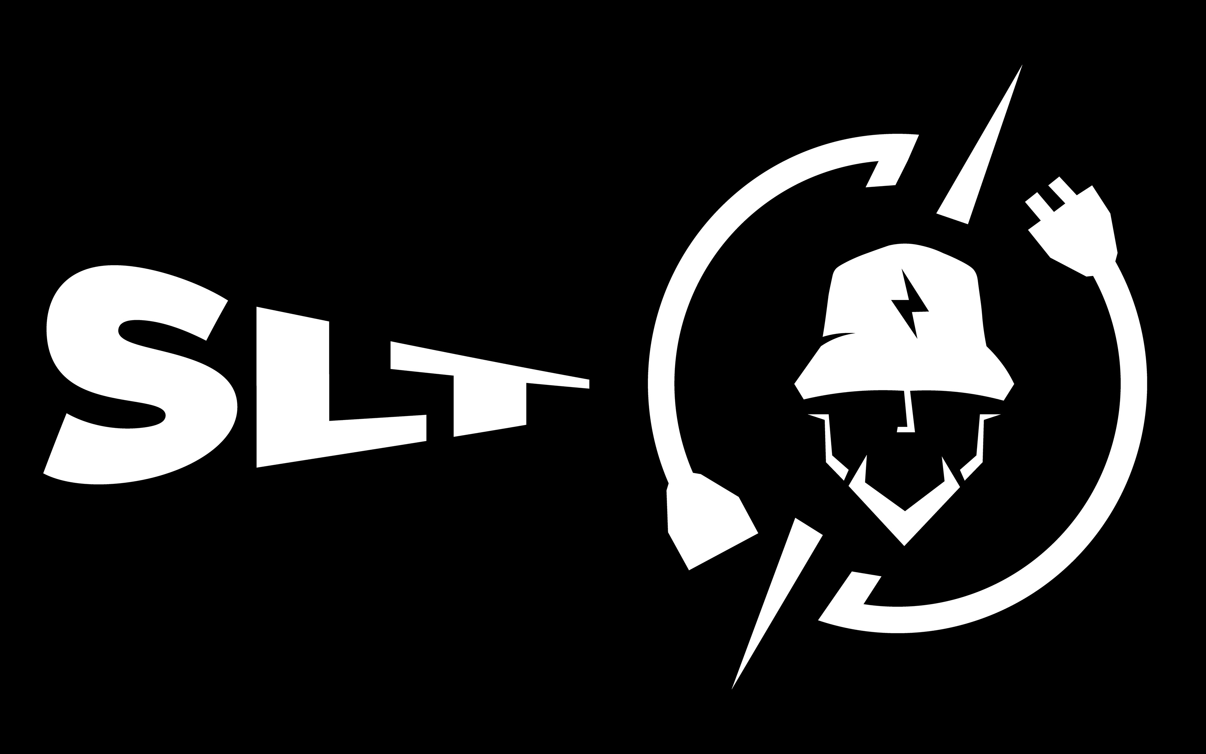
Black & White Variations
To ensure maximum versatility and readability across different applications, the logo was designed to function perfectly in full black and full white versions.
These monochrome variations maintain the clarity, balance, and character of the brand even without gradients or color accents, making them ideal for print, engraving, uniforms, and simplified branding contexts.
These monochrome variations maintain the clarity, balance, and character of the brand even without gradients or color accents, making them ideal for print, engraving, uniforms, and simplified branding contexts.
Close-up Details
These close-up shots highlight the finer details of the SLT logo system.
The metallic gradients, sharp geometric edges, and color transitions are showcased at a larger scale to reveal the craftsmanship behind the design.
Each zoomed section emphasizes key visual elements — the electrician silhouette, the directional arrows, and the polarity-based cable shapes — demonstrating how precision and clarity are preserved even at small sizes.



Color Palette
The visual identity uses a clean and balanced color system inspired by electrical polarity and solar energy.
The Electric Blue and Solar Red represent the two poles of the electrical system, while the Metallic Grey references the tools, hardware, and equipment used in the field.
These tones were selected to ensure strong contrast, modern aesthetics, and high readability across digital and print applications.
Vector Solar Panel Illustration
A detailed vector illustration was created for the rear sticker design.
The panel is fully built from scalable vector shapes, allowing perfect clarity at any size.
Each cell, edge highlight, and shadow was manually constructed to match the realistic look of photovoltaic modules while keeping a clean and consistent graphic style.
Each cell, edge highlight, and shadow was manually constructed to match the realistic look of photovoltaic modules while keeping a clean and consistent graphic style.

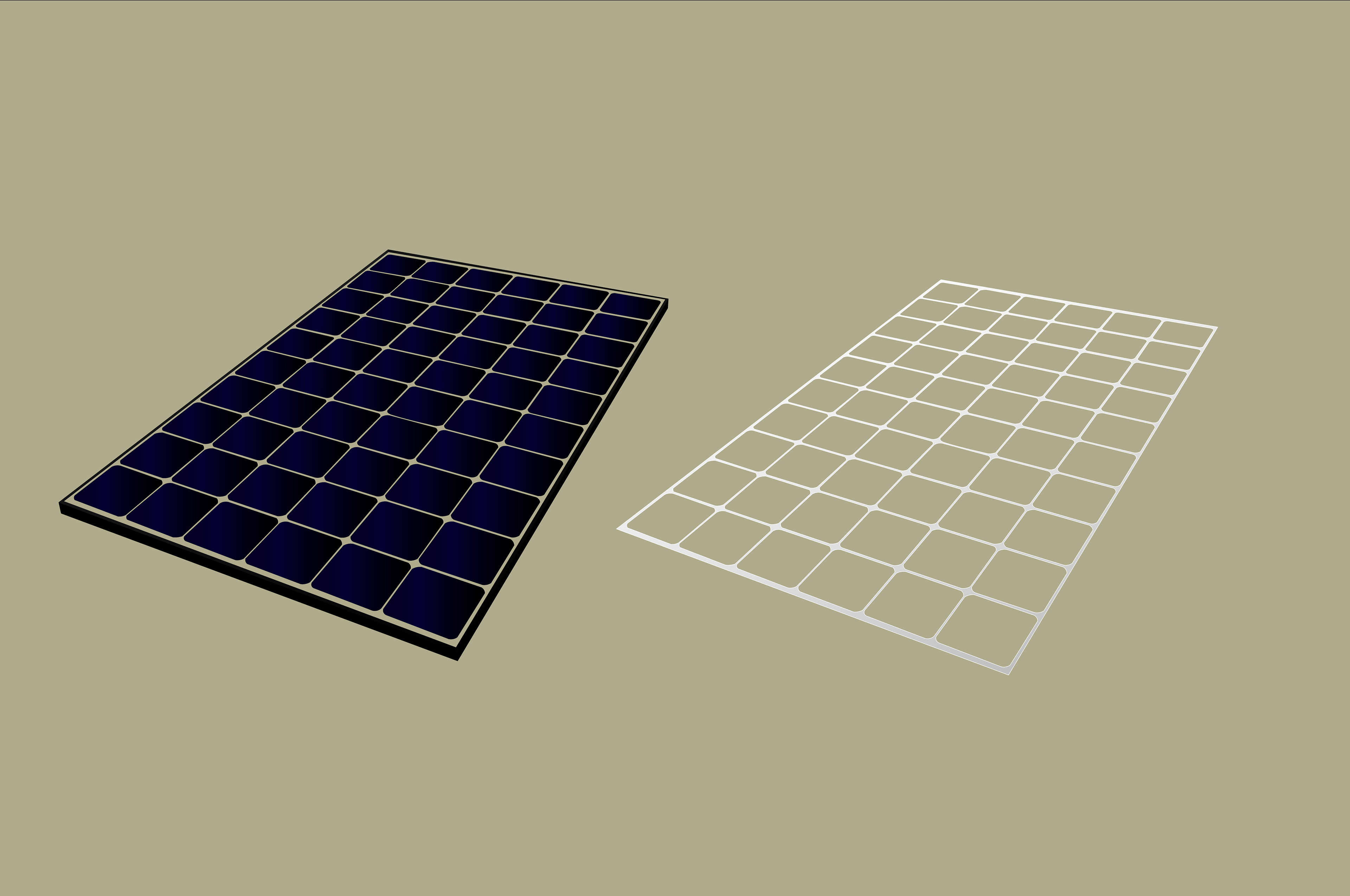
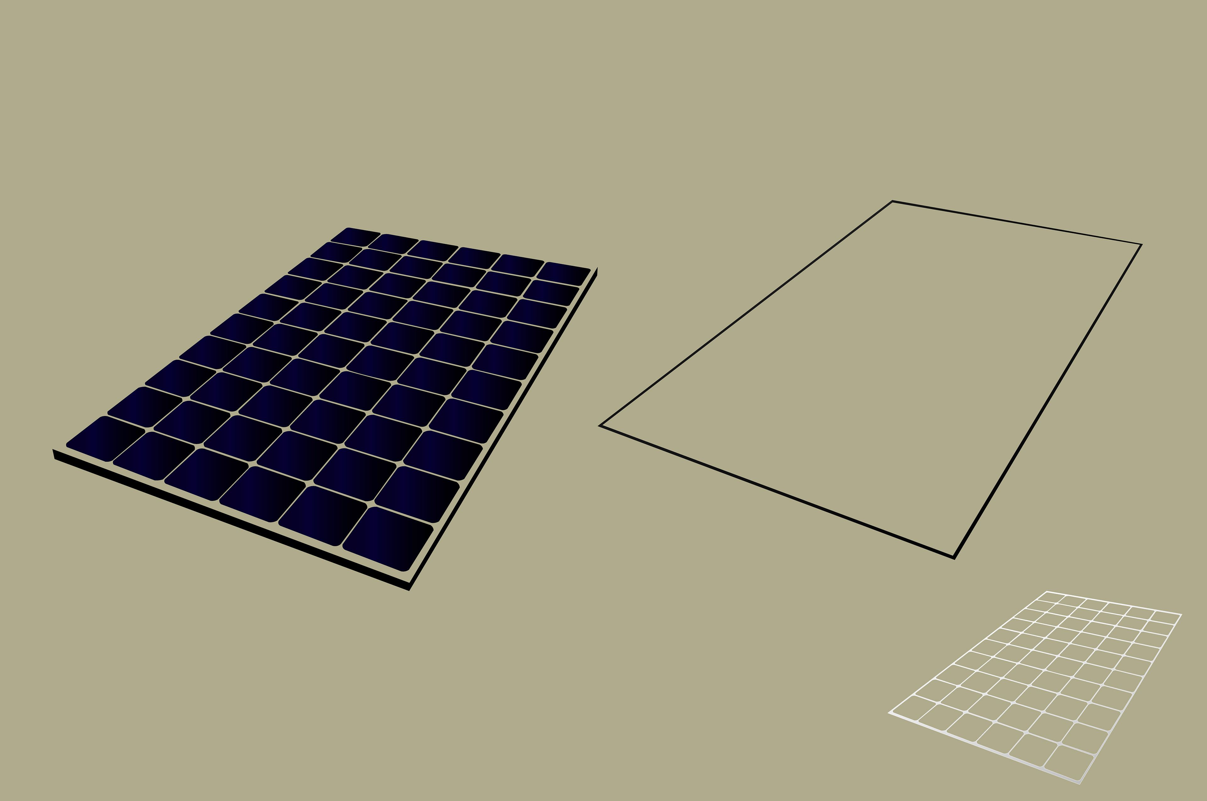

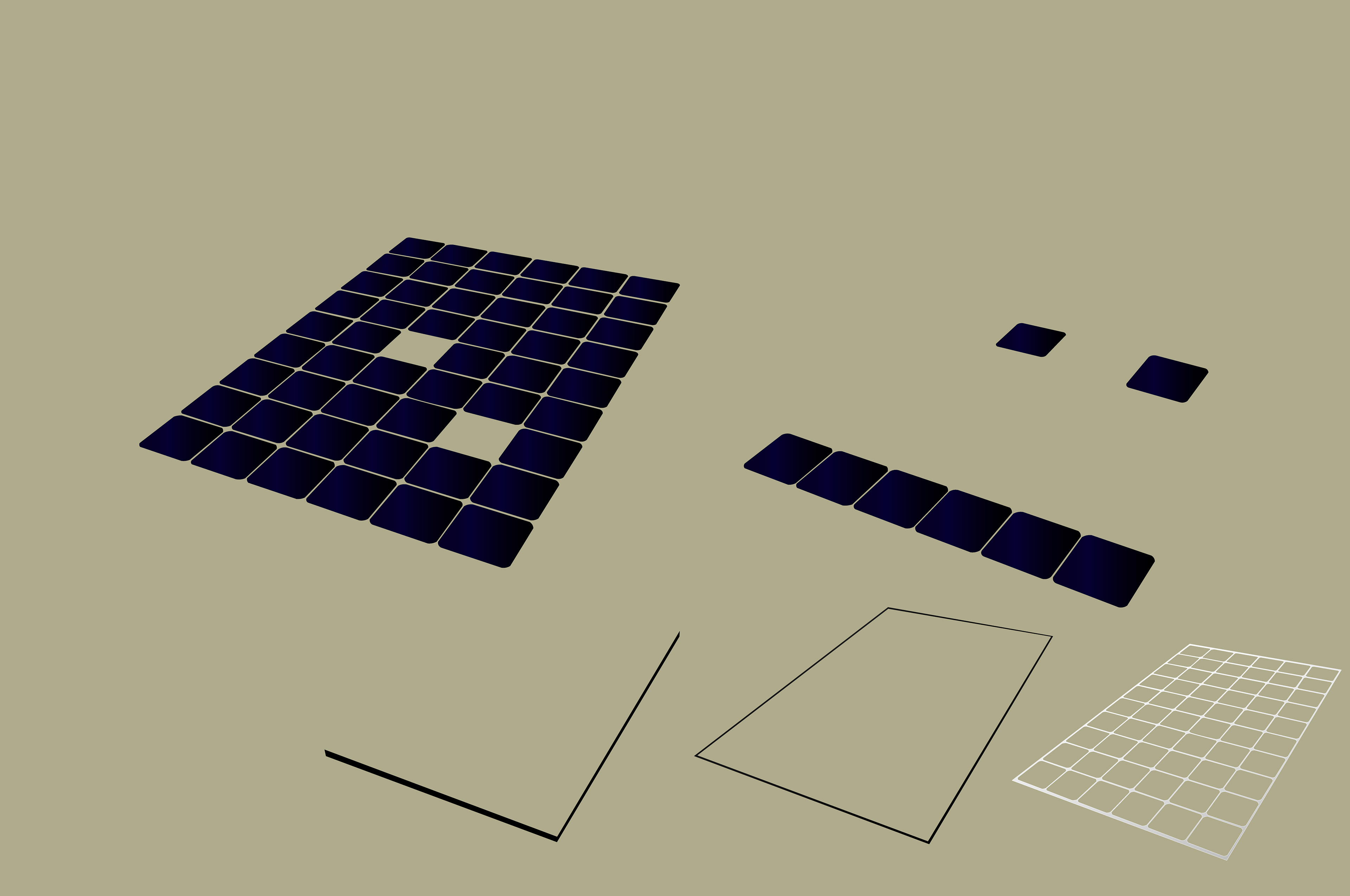
Several breakdown views show how the illustration was assembled:
the base grid structure
the outer frame
individual solar cells
highlights and reflections
the final perspective layout
This modular vector approach ensures perfect clarity on large prints, vehicle graphics, and any future promotional materials.
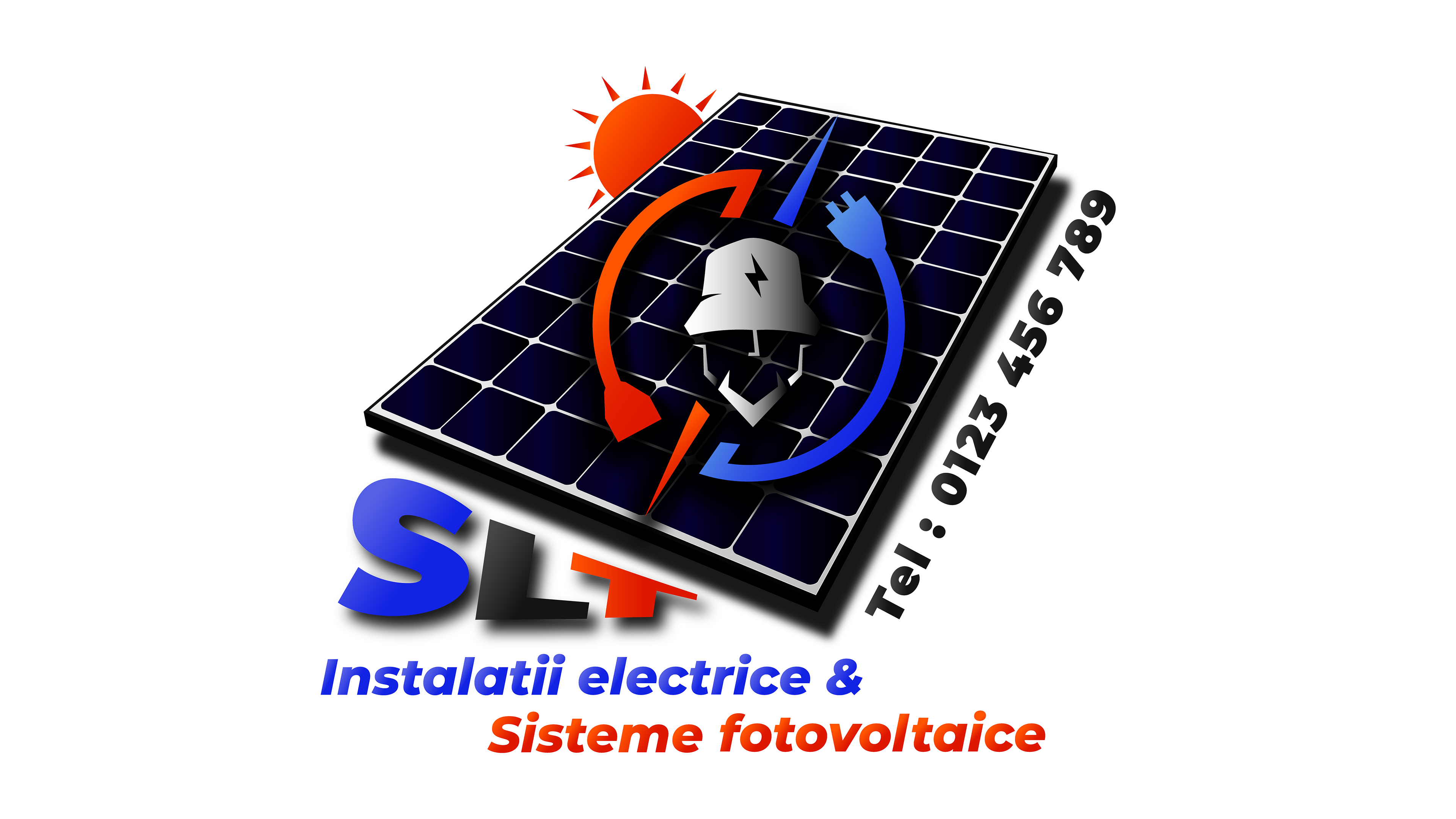
Full Advertising Sticker — Photovoltaic & Electrical Branding
To extend the SLT visual identity into real-world usage, several full advertising stickers were created specifically for the rear panel of the company vehicle.
The designs combine the main SLT emblem with a photovoltaic panel background, a sun icon, service descriptions, and the company’s contact information.
The designs combine the main SLT emblem with a photovoltaic panel background, a sun icon, service descriptions, and the company’s contact information.
Multiple text layouts were developed to test readability, hierarchy, and balance, ensuring that the final sticker remains visually strong and easy to understand from a distance.
These variations demonstrate how the brand adapts to different compositions while maintaining a coherent and professional appearance.
These variations demonstrate how the brand adapts to different compositions while maintaining a coherent and professional appearance.

Project Summary
The SLT branding project brings together technical precision, bold geometry, and a modern visual language tailored for the electrical & photovoltaic industry.
From the logo system to real-world applications, each element was designed to build a strong, recognizable identity.
From the logo system to real-world applications, each element was designed to build a strong, recognizable identity.
Thank you for viewing!

